

Career Pathway Institute

Career Pathway Institute (CPI) is a not-for-profit organization aiming at helping new immigrants to build successful careers in the US. CPI organizes career workshops, panel discussions with working professionals and hiring managers, career fairs, career coaching, etc.
We met with the non-profit’s CEO, Kate, in April 2023 when they were looking to redo the existing website as they planned to launch new features like AI resume builder and transfer events from Eventbrite to their website.
What started as a quick UI gig ended up being a UX/UI design project with some UX writing twist and ongoing partnership with the non-profit on launching new features.
Role
Lead UX/UI Designer
Location
San Francisco Bay area, CA
Timeline
Apr – Sept 2022
Tools
Figma, Parrot AI
Responsibilities
Design strategy, Visual Design, UX, Research
Team
CEO, Product Manager, Engineer, 2 UX/UI Designers
PROBLEM
Various channels for users to reach the CPI ended up in significant time resources to maintain up to date (Social media, website, Eventbrite, etc.).
There is no platform to promote CPI's new features and services, like resume generator, coaching, etc. Minimum to no registrations through the website.
Lack of appealing and modern design to promote non-profit partnerships.
OUTCOME
The user sign-up rate through the website increased by 150%.
51.6% bounce rate with a 10-minute average session, mainly on the new feature on the platform.
UI guidelines for consistent marketing campaigns to create a brand presence for the non-profit.
First donations and partnerships with local businesses.
Process
01/09. Market Research. Who are these people, and why do they need this service?
Target Audience
People aged between 25-55 y/o.
People who immigrated to the US within five years.
Newly residents in the US.
They are speaking English as a second language.
Resource: Client's researchWhy do people need help finding a job?
In 2023, the USA has 9.8 million job openings in the U.S., but only 5.9 million unemployed workers, making it a 3.8% unemployment rate. Still, the average time to find a job is about 5 months.
While the whole situation with the labor market is disturbing, making it harder for higher-education immigrants to land a job offer. The latest research stated that 85% of all jobs in the U.S. are filled through networking, with 70% of them never posted publicly.
Resource: UpwardlyWhy do internationals need help finding a job?
Only 17% of participants had any U.S. work experience in their field of specialization, facing many U.S. employers that don’t recognize overseas education and experience.
71% of immigrants had difficulty evaluating which career paths, professional courses, or credential evaluations were worth pursuing.
02/09. Competitive Analysis. What people are used to?

INSIGHTS
Personalization: Consider personalizing the website experience based on the user's needs and interests.
Supporting Surroundings: Create illustration and visual language to help immigrants learn in a more fun, lighter surrounding.
Social media integration: Integrate the website with the organization's social media channels to create a cohesive brand experience and reach a wider audience.
User-generated content: Incorporate user-generated content such as testimonials, reviews, and success stories to provide social proof and build user trust.
UI: Avoid heavy colors and incorporate lighter ones into modern design.
Visuals: Use infographics and cards to help digest information for the user.
03/09. Website audit. What is not working now?
We audited the existing website using a feedback capture grid, pinpointing areas for improvement in user flow, site structure, and UI. We assumed that the main issues are:
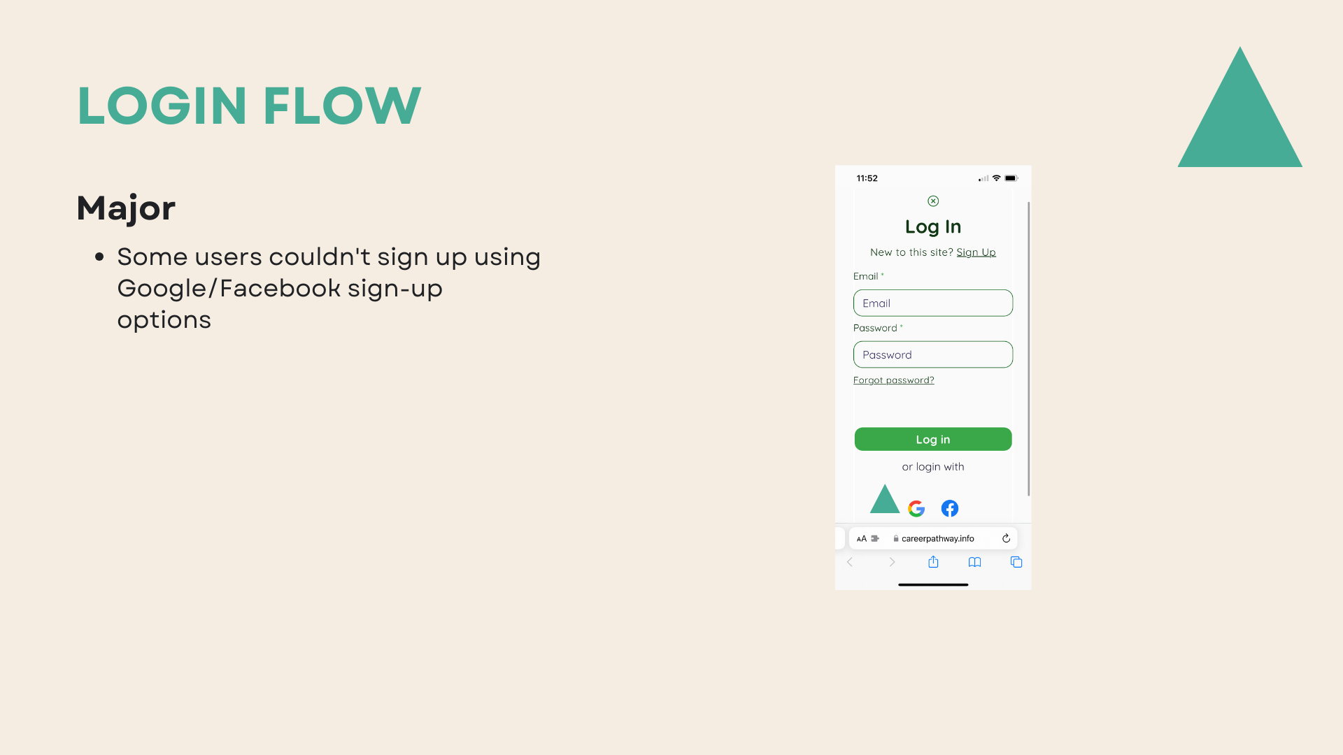
Sign-up access required 2-3 steps, contributing to drop-out rates.
The landing page featured 18 sections, hindering the clarity of the company's message.
Confusing CTAs left users uncertain about their actions.
Unclear user flows made it difficult for users to identify goals and the paths to reach those goals.
Page names lacked consistency with their content.
Solution:
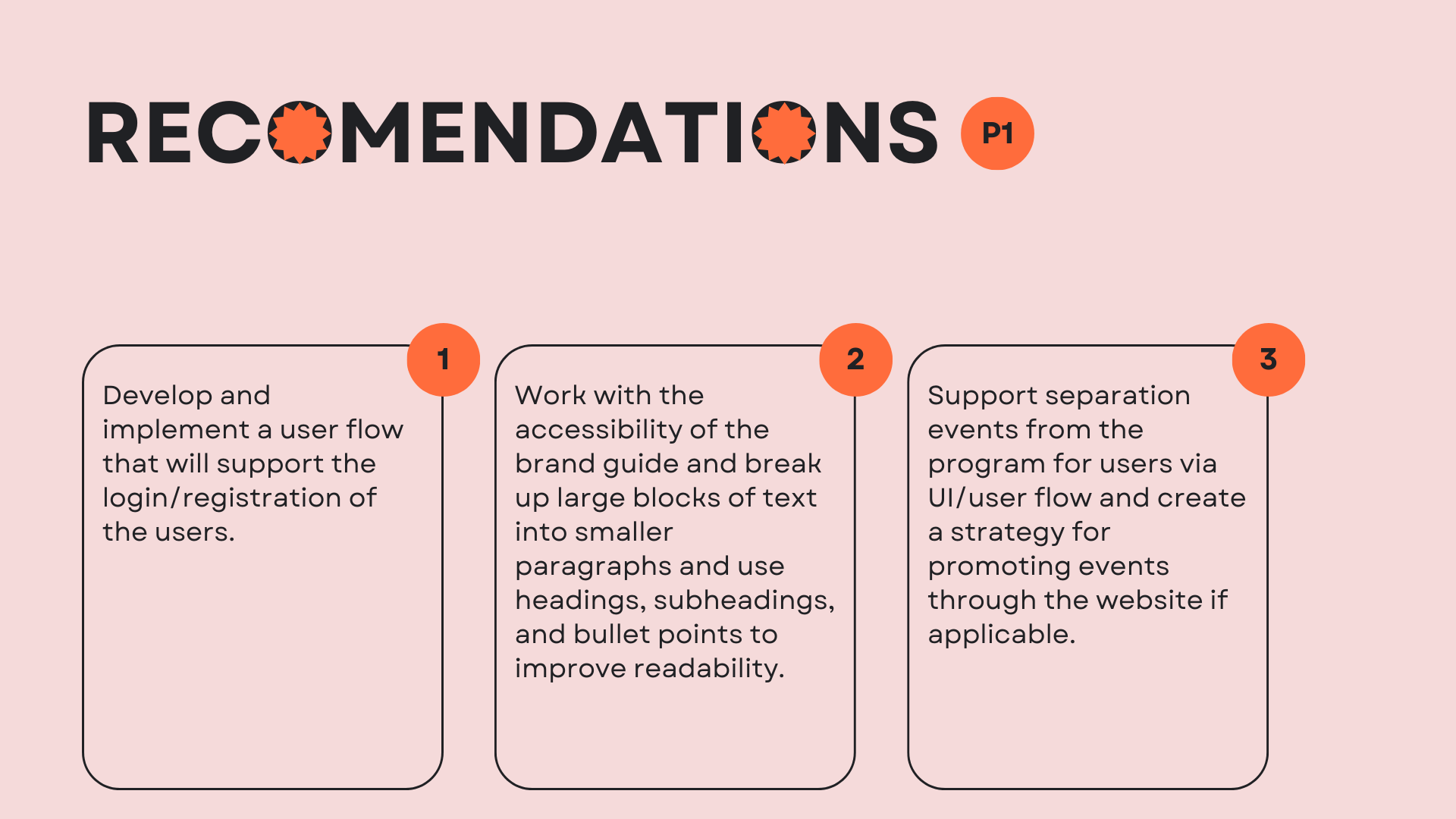
The main change is to reduce the number of steps for a user to achieve their goals, e.g., a user will be one click away from registering. It increases the point of entrance amount for the user up to 3.
We have reduced the number of blocks/sections on the landing page from 18 to 8 to make the navigation and the company message easier to understand.
Reorganizing the pages by roles gives a customer a better visibility of the possible paths.
A new structure supports users, guiding them along the website.
Necessary prioritization of the content on the landing page to make the user journey more exciting.
Introduced more explicit and active messages on CTA buttons.
Added storytelling in About CPI by changing the structure of the website pages.
How do we support the brand through the visual elements?
The current website's UI fell short of establishing a cohesive visual identity. To address this issue, we developed a style guide/mood board to pinpoint the primary design direction.
Considering the company’s identity and brand guidelines, we settled on a mood board with blue and green as primary colors, symbolizing calmness, creativity, and coolness, orange as an accent color to show energy, warmth, and enthusiasm.
The design elements, such as cards and characters’ illustrations, enhance the company’s image as young, energetic, and trustworthy.
PRIORITIZATION
P1: Streamlining user flows for events and coaching programs to enhance access to the company's core offerings.
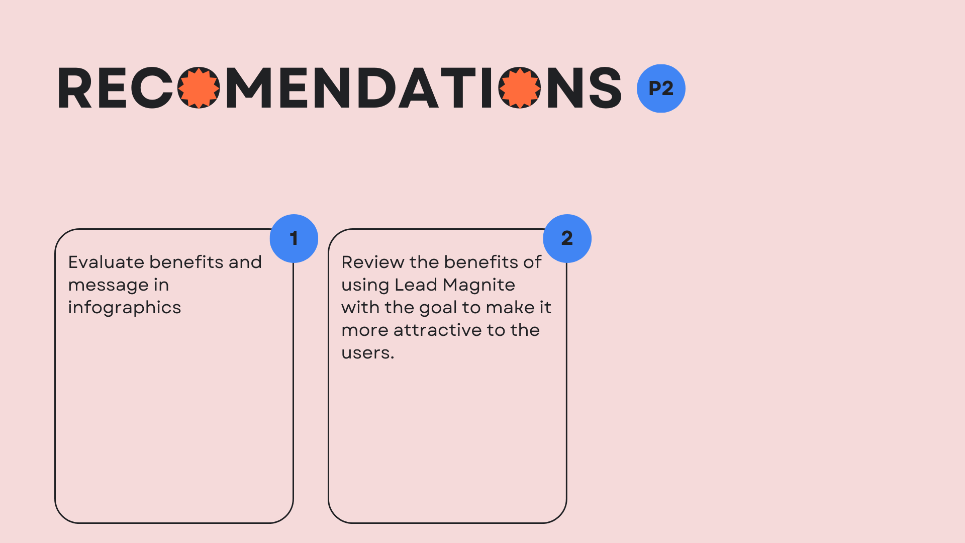
P2: Enhancing the resources page to empower users to access valuable resources, augmenting the company's value proposition.
P3: Crafting company information pages to offer users a personalized glimpse into the company and its dedicated team.
P4: Creating a speakers page to provide users with insightful information from esteemed business experts.
04/09. Ideation. How can we tell a story to the user?
05/09. Design of the first iteration.
Design decisions
Incorporating illustrations to lighten up the content.
Use cards to help users digest the information.
Avoid orange/brown and focus on blue color to stand out.
Promote services and social media for reliability
Add a feature of free guidelines to promote the registration process.
Simplifying the navigation bar to help users be in control while exploring the services CPI provides.
Focus on the desktop based on analytics provided by the client: 68% of traffic was from the desktop platform.
ITERATION 1 OUTCOMES
Bounce rate 51.9%
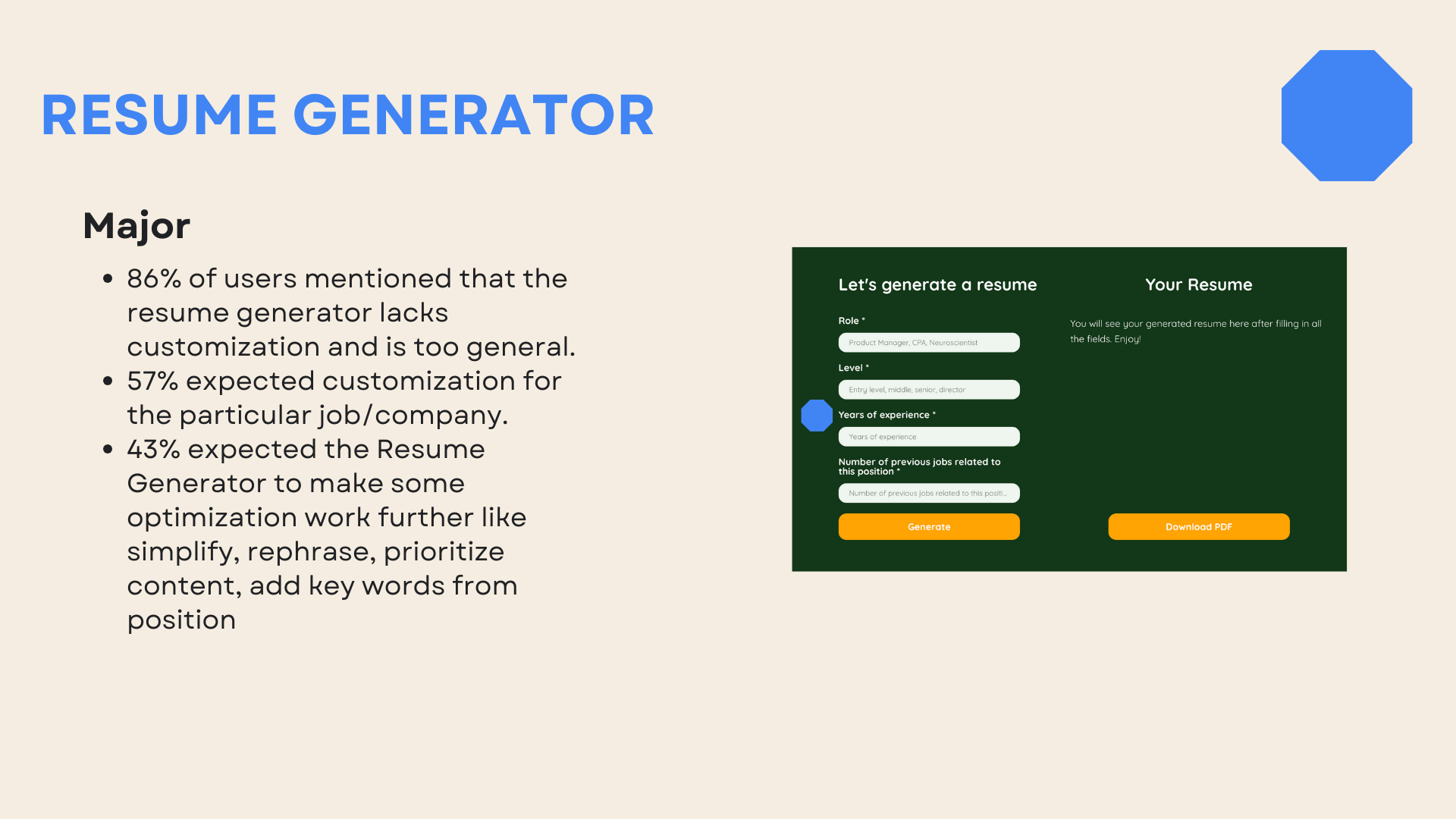
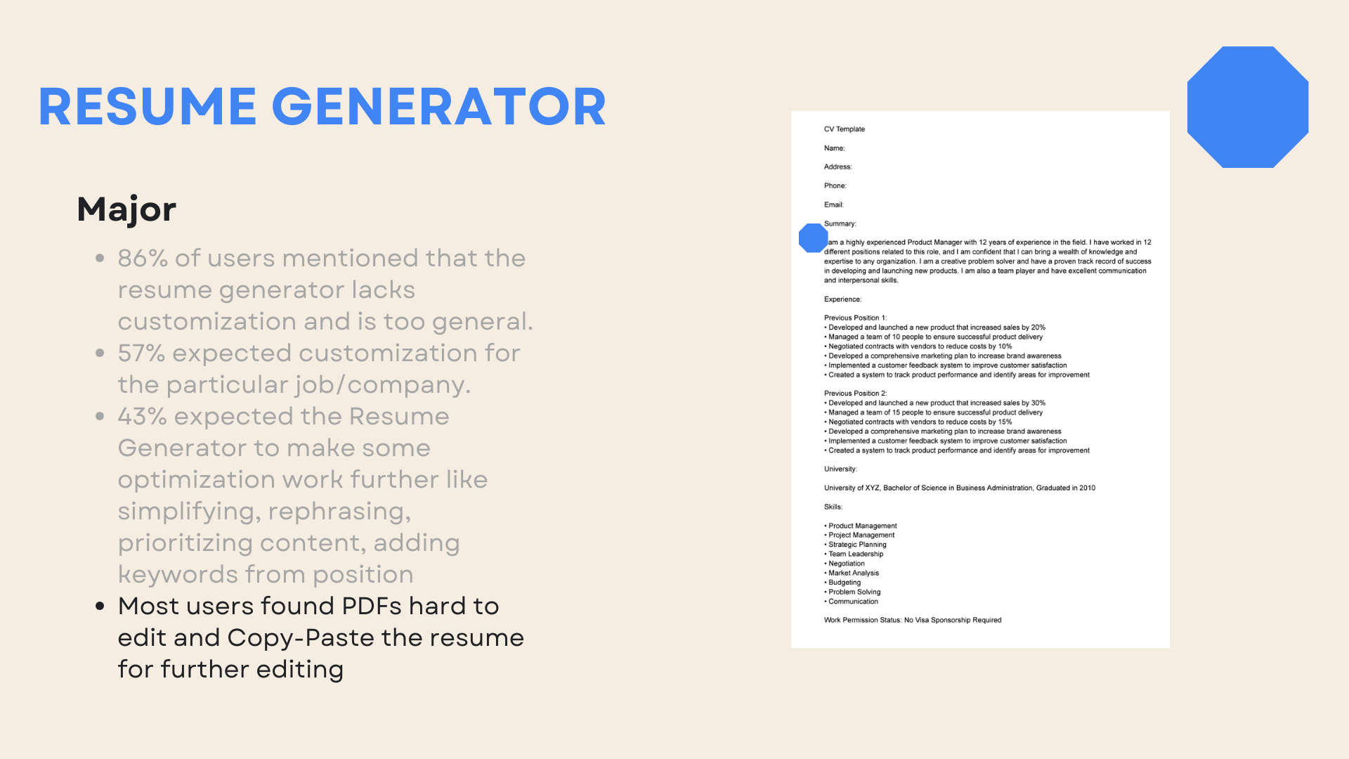
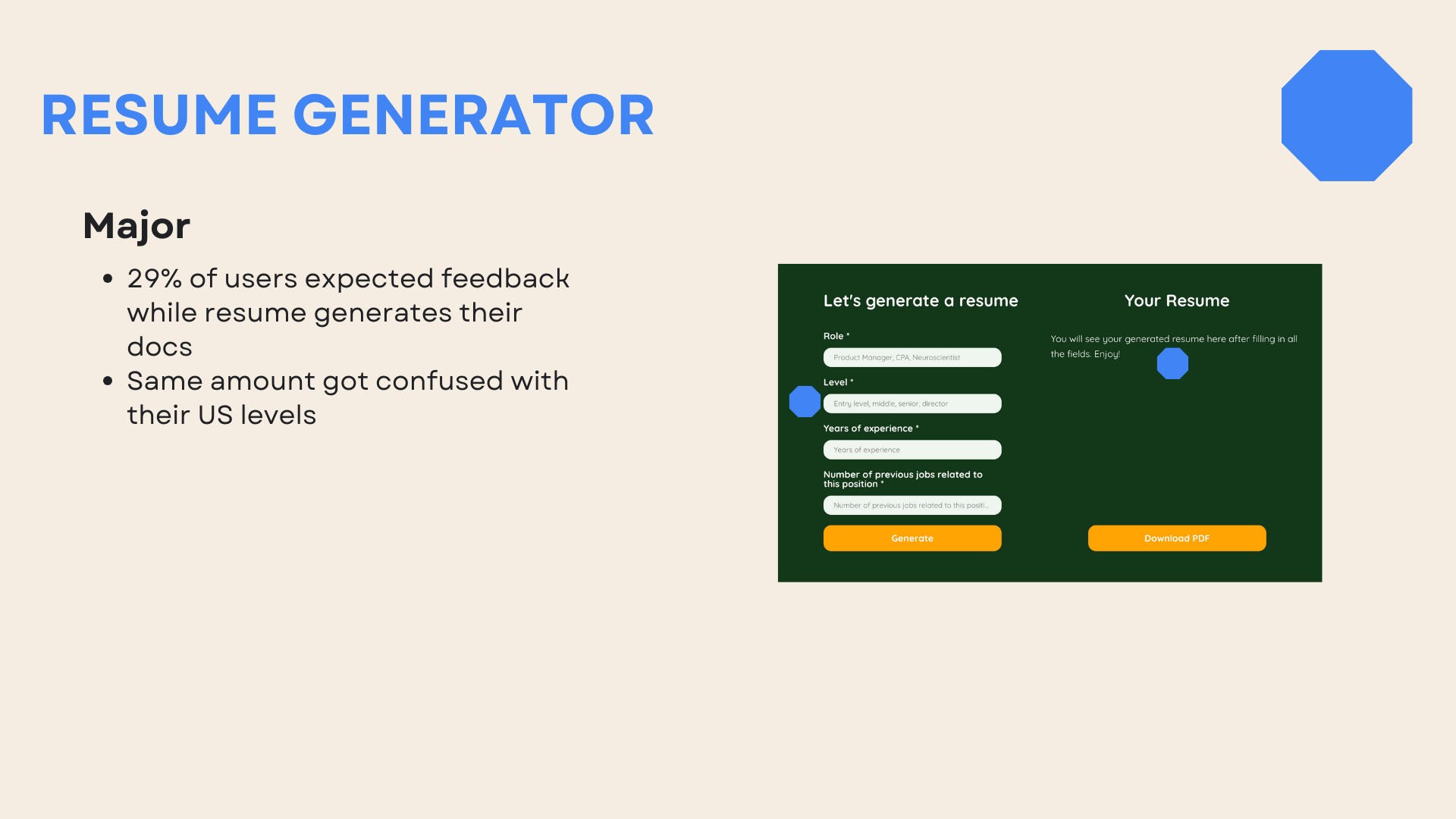
New features implemented: Job posting for volunteers, Resume Generator, and Financial reports.
06/09. Usability tests.
Purpose
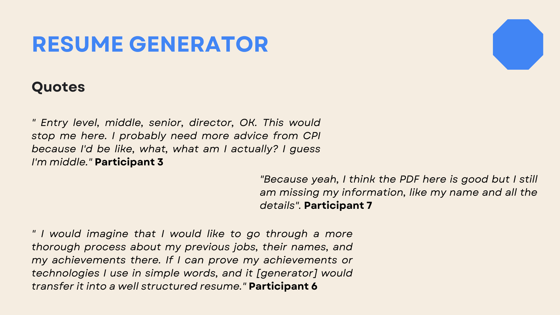
Identify usability barriers, pain points, and areas for improvement within specific user flows: sign up for events/programs and cover letter/resume creation.
Goals
Evaluate how effective the website is at encouraging users to donate.
Understand users' difficulties or frustrations when attempting to sign up for events.
Assess the user experience of creating a resume and a cover letter using the website's functionality.
Identify opportunities to enhance the website's user interface (UI) and make it more intuitive and user-friendly.
Gather user feedback for future feature enhancements Add-on.
Method
Usability studies with the script and the tasks for users to complete via remote moderated sessions (Zoom/Google Meet).
Participants criteria
People aged between 25-55.
Immigrated to the US within the last five years.
Residents of USA.
English as a second language.
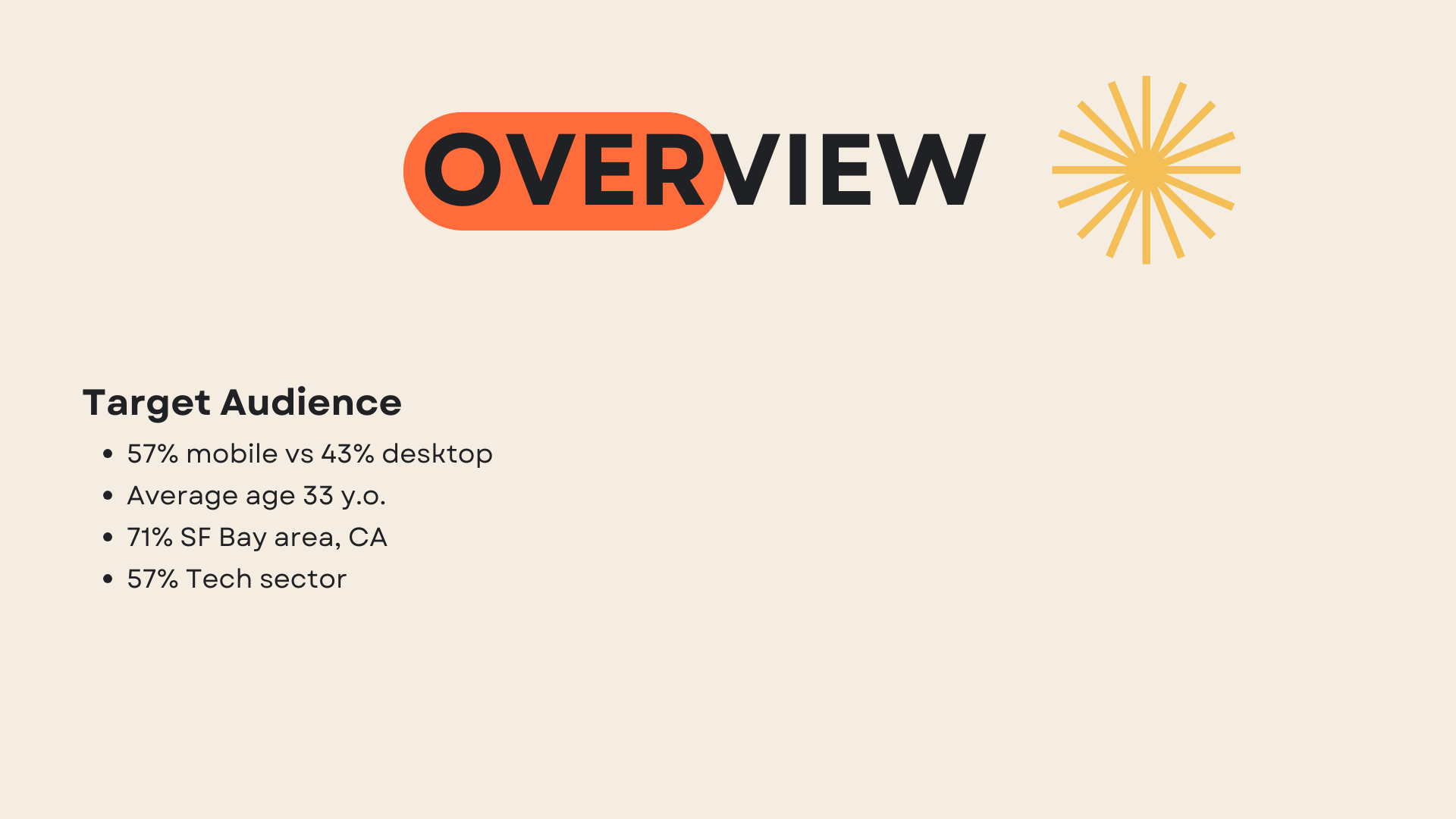
Participants statistics
57% mobile, 43% desktop.
Median age: 33 y/o.
71% Female, 29% male.
71% from the SF Bay Area
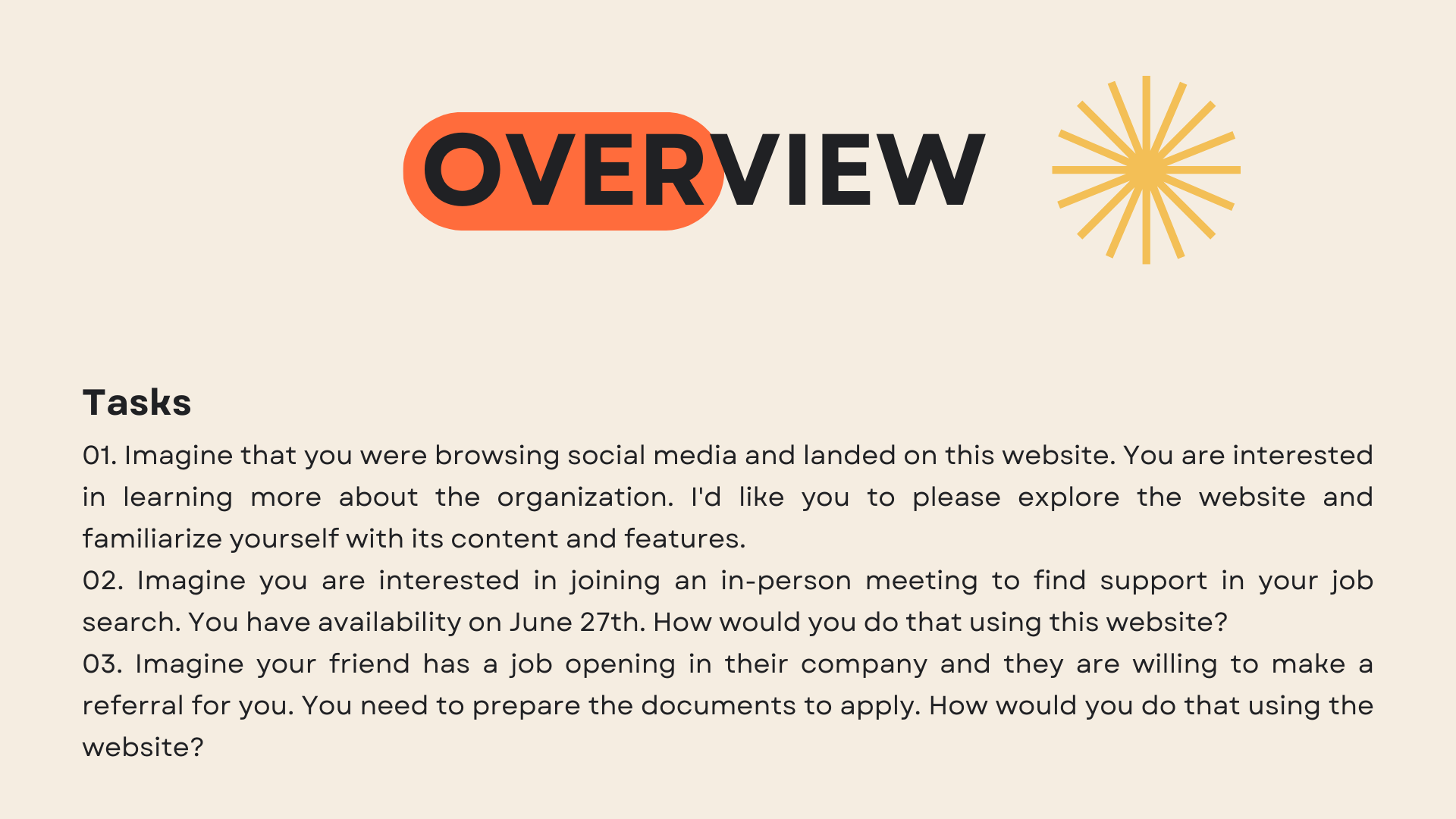
User tasks:
Imagine that you were browsing social media and landed on this website. You are interested in learning more about the organization. Please explore the website and familiarize yourself with its content and features.
Imagine you are interested in joining an in-person meeting to find support in your job search. You have availability on June 27th. How would you do that using this website?
Imagine your friend has a job opening in their company and they are willing to make a referral for you. You need to prepare the documents to apply. How would you do that using the website?
Extra Aha moment
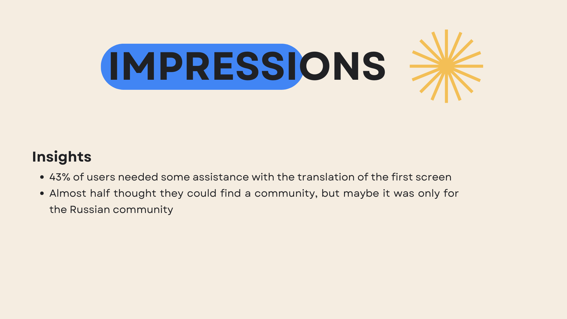
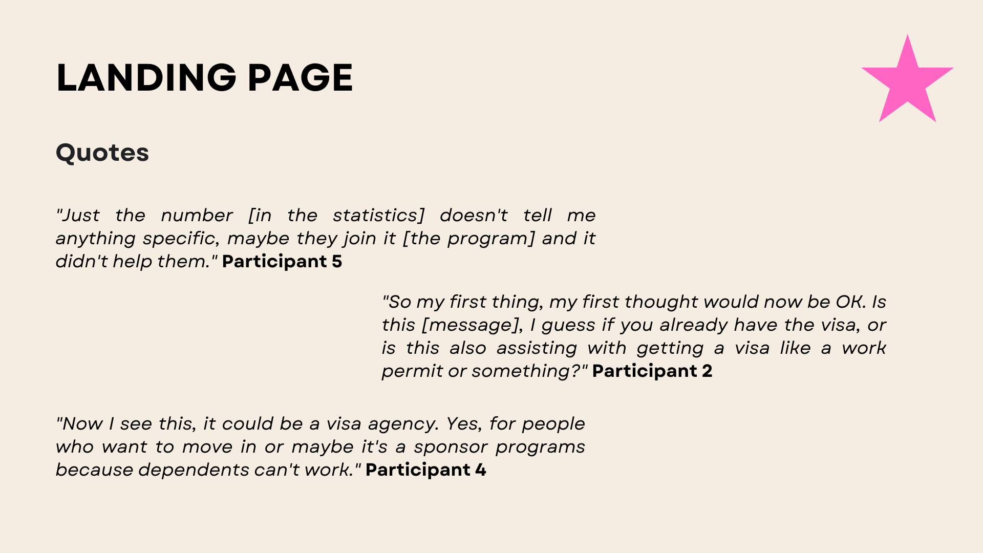
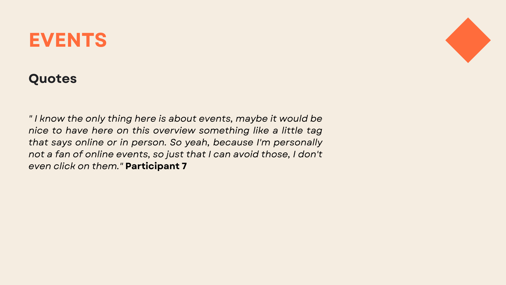
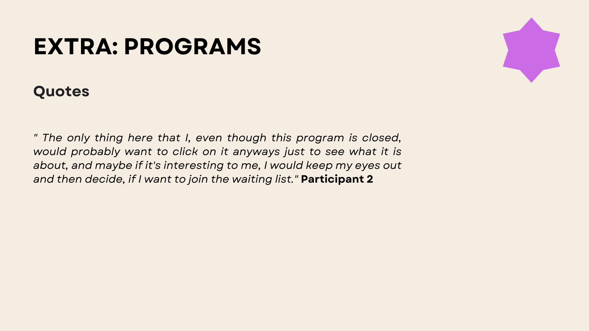
All users had challenges with translation and asked clarifying questions regarding messages listed on the website or even CTA's and titles.
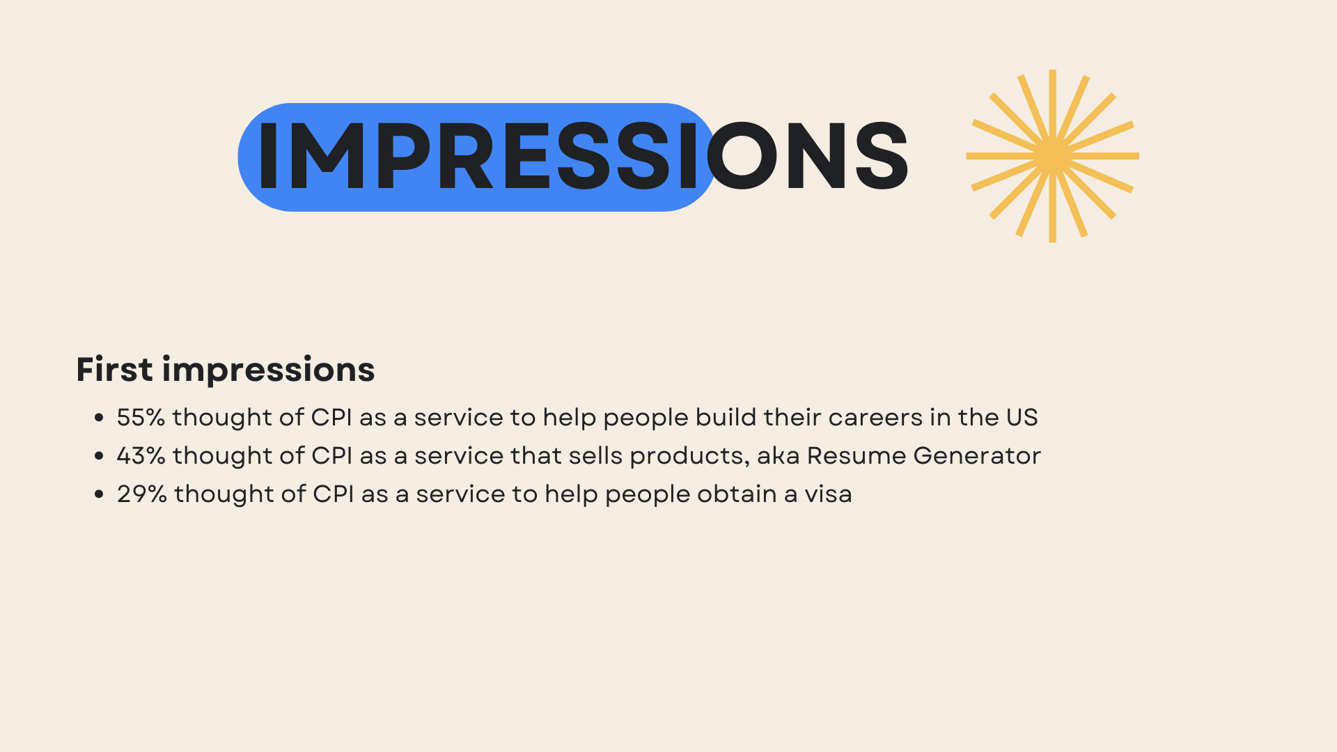
WHAT WORKED WELL
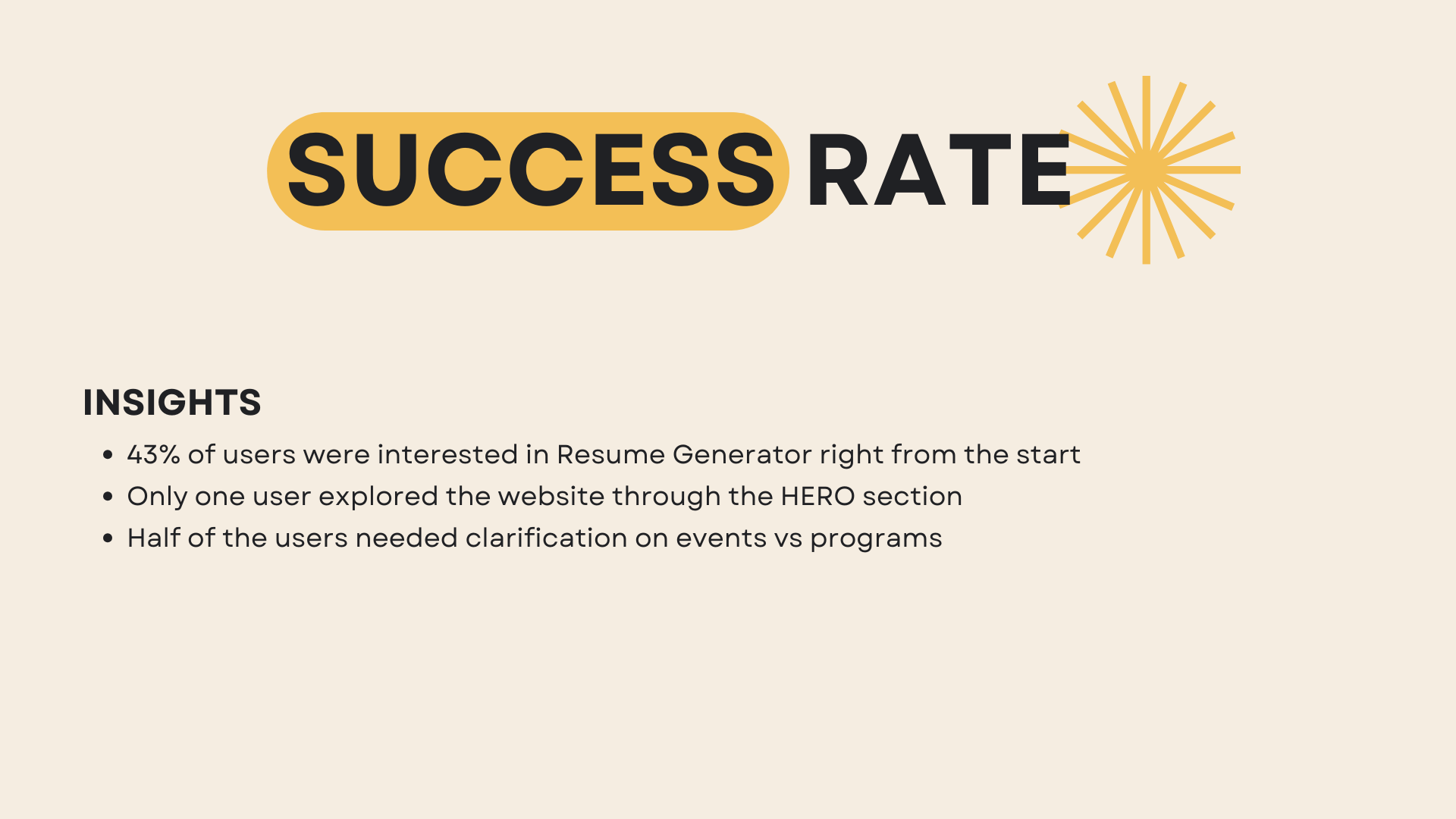
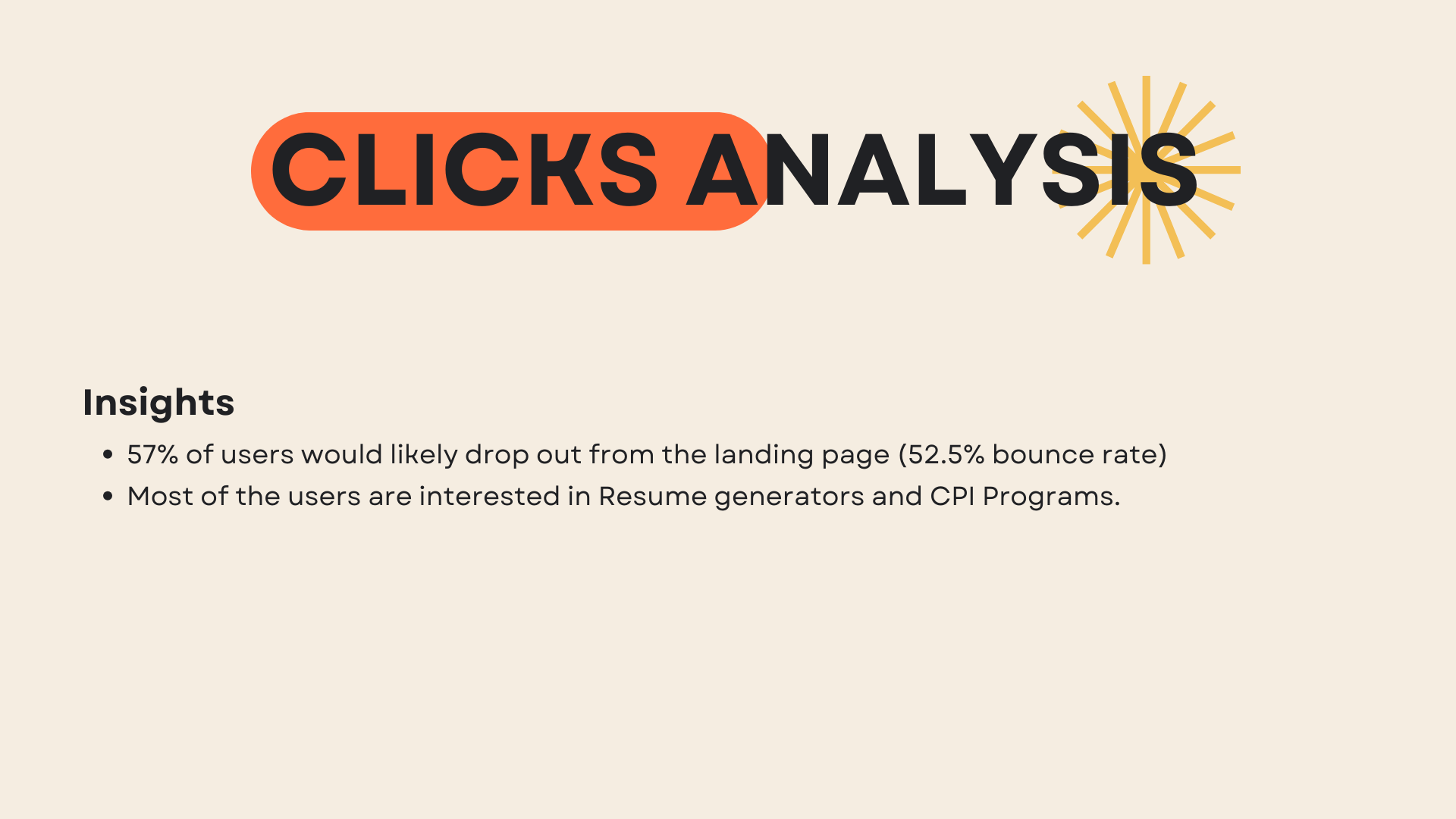
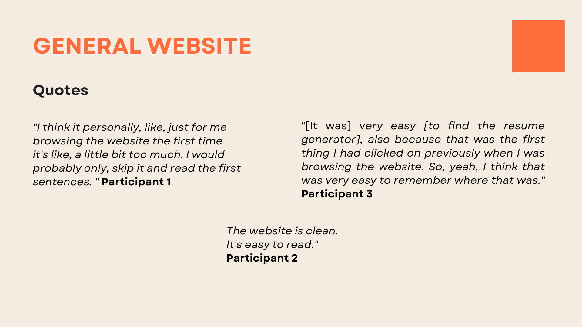
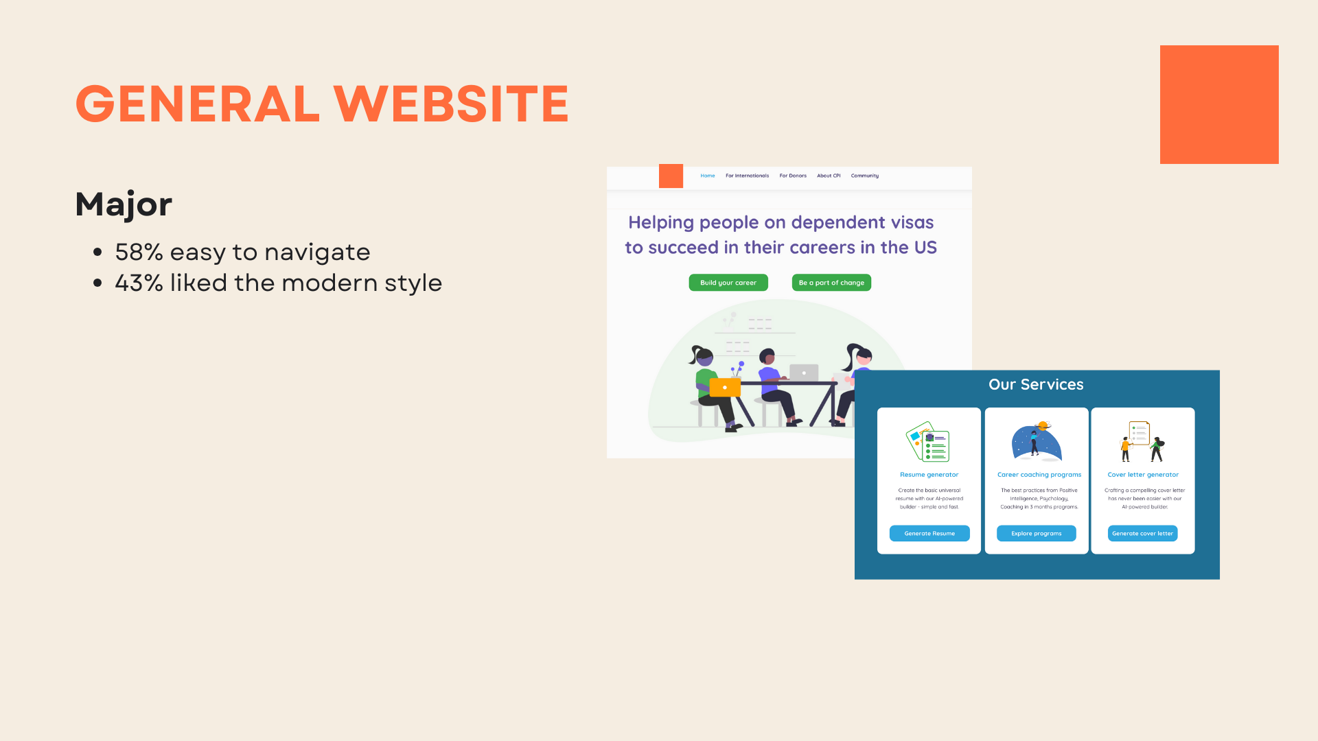
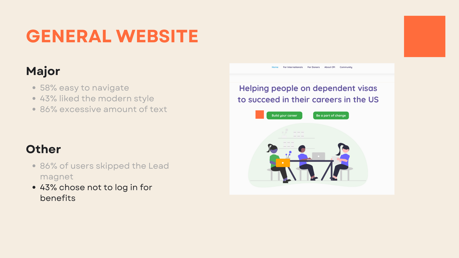
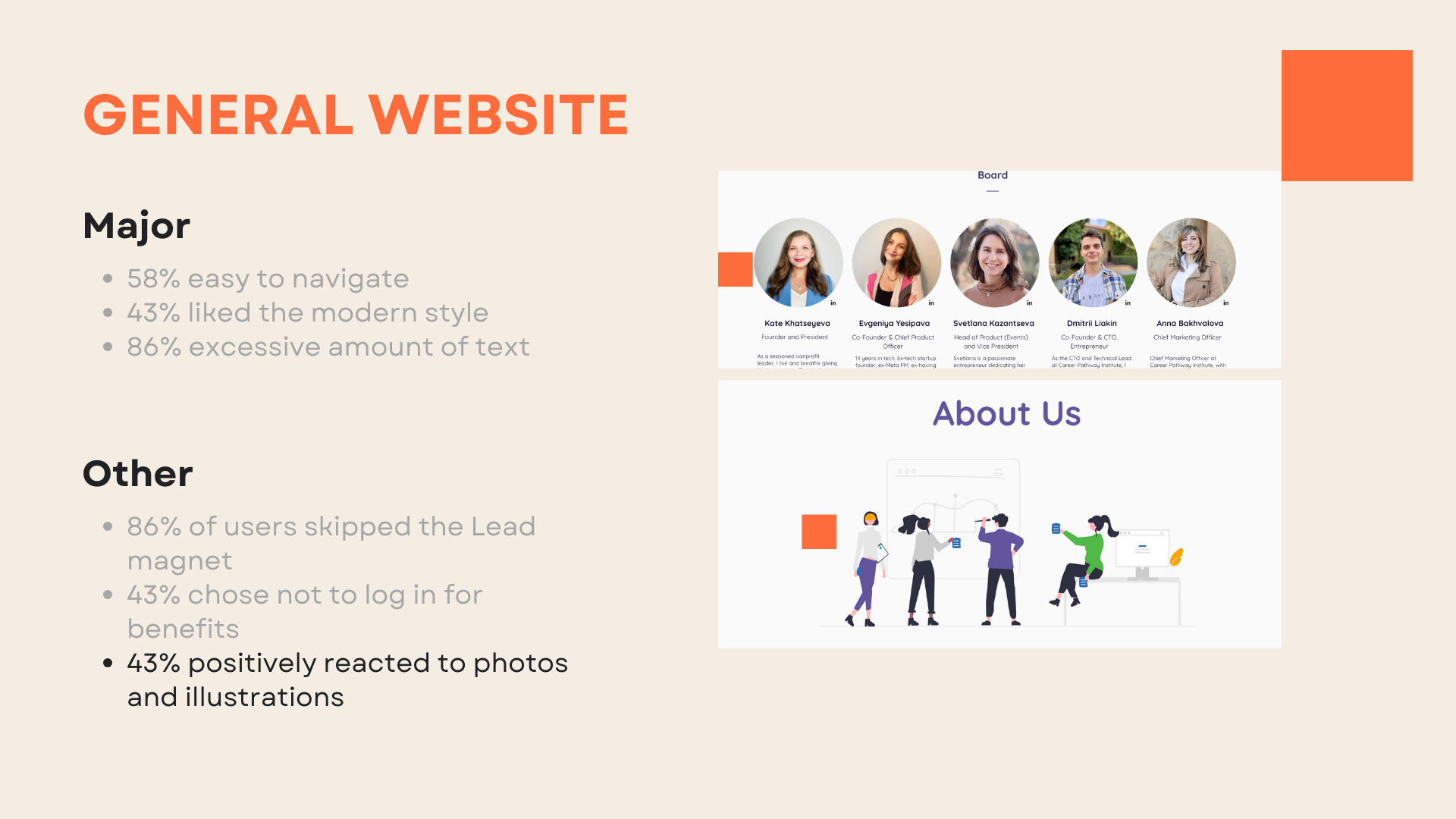
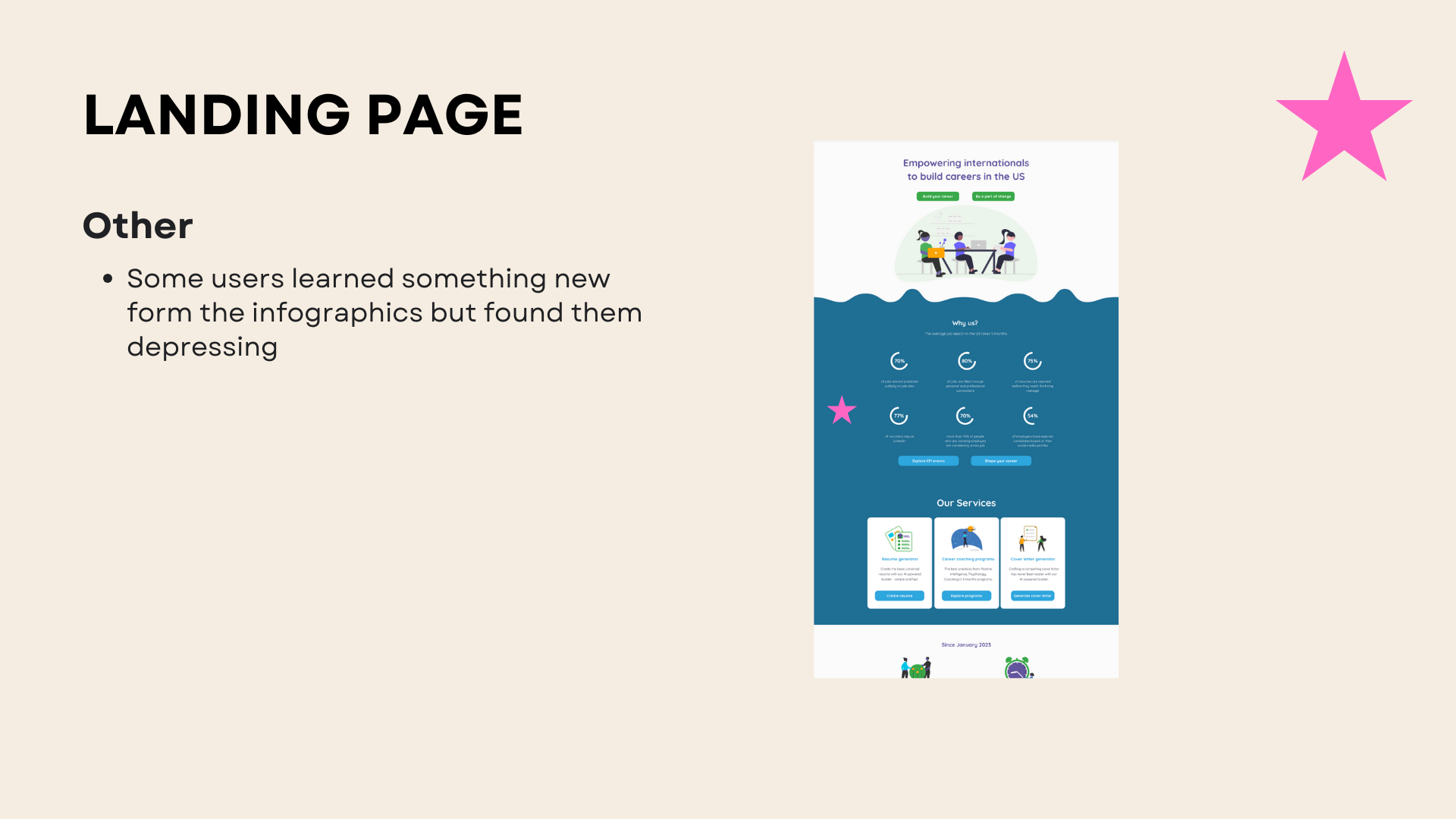
43% positively reacted to photos and illustrations and the overall style of the website.
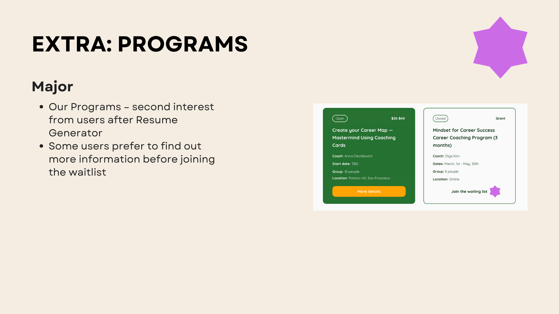
Half of the Users found services more exciting and beneficial than other website features like events, etc.
86% completed RG tasks and felt good and motivated to sign up.
WHAT WORKED NOT SO WELL
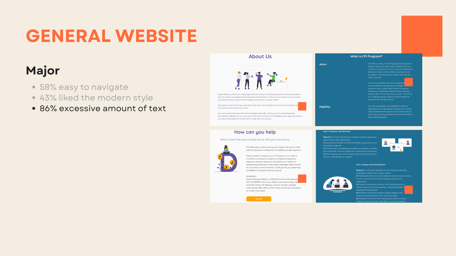
86% of Users still found excessive text on the website.
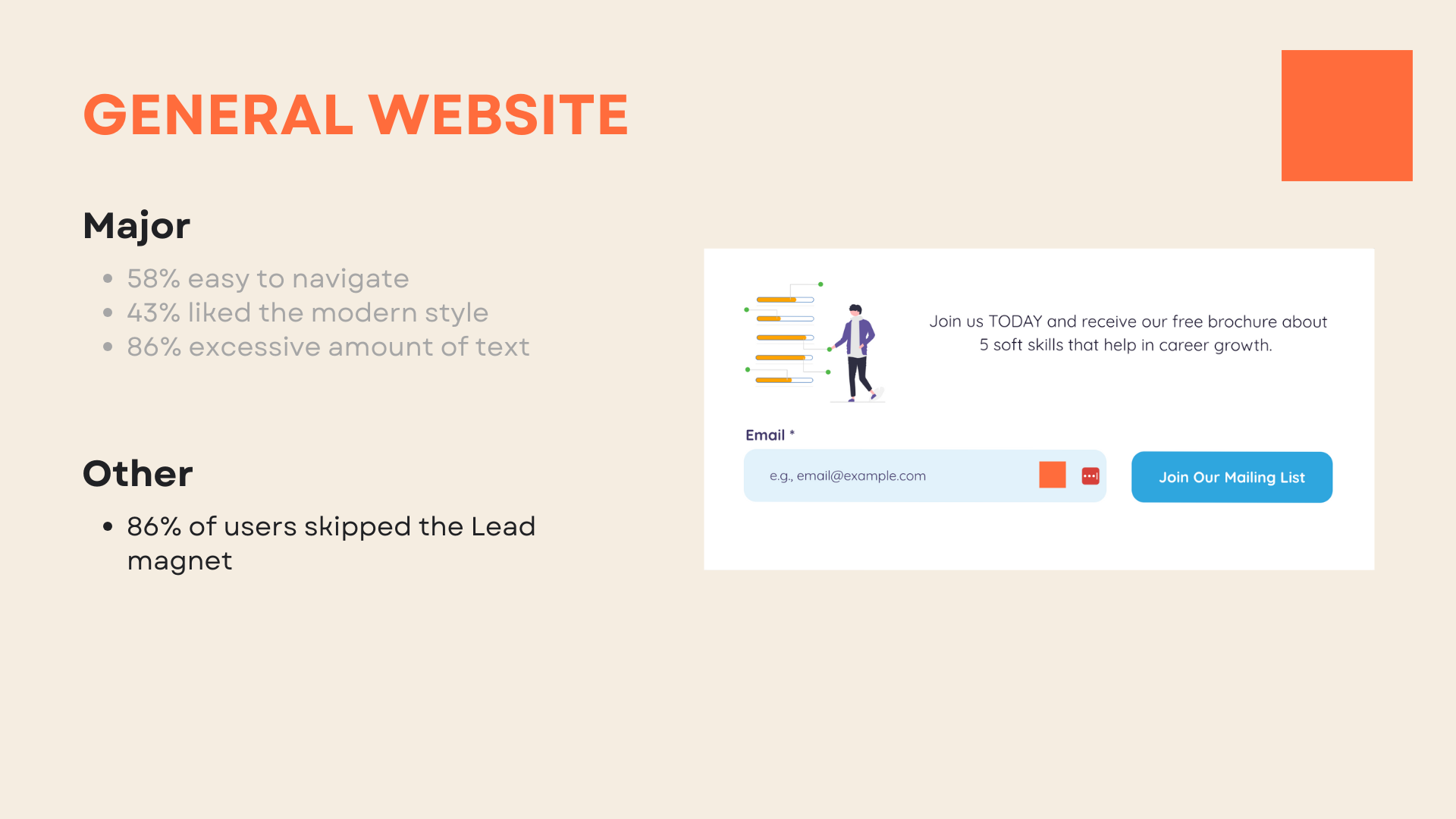
86% of Users skipped free brochures, which did not enough benefits.
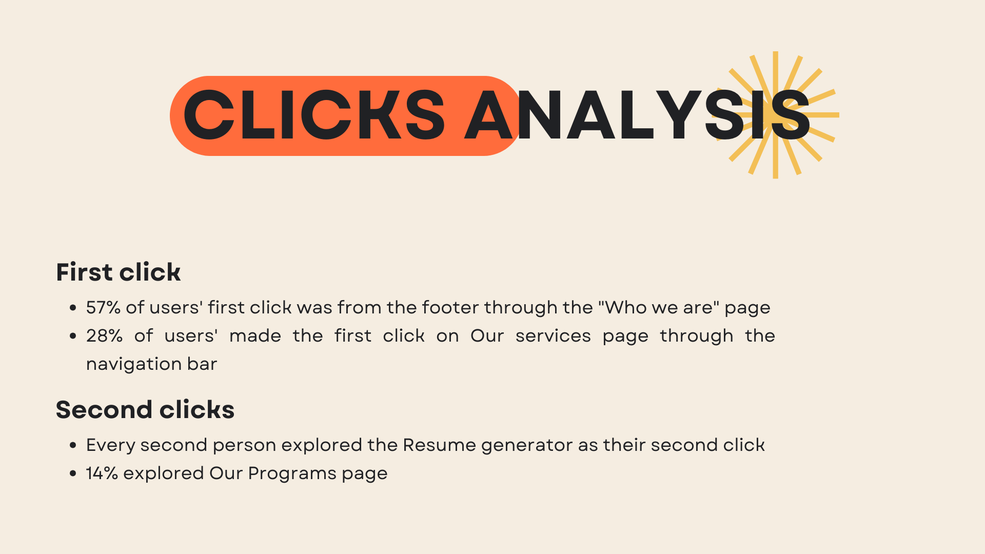
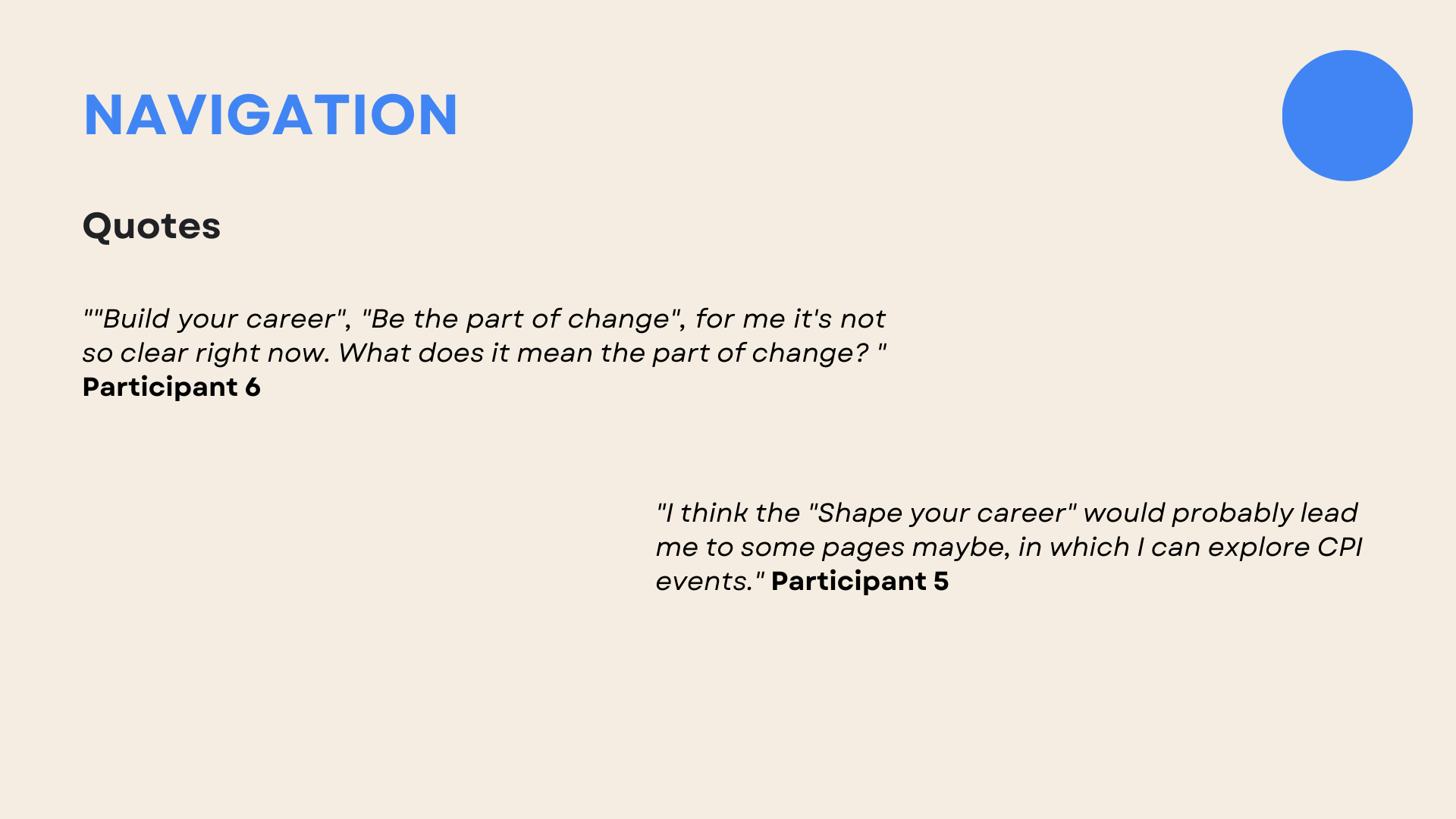
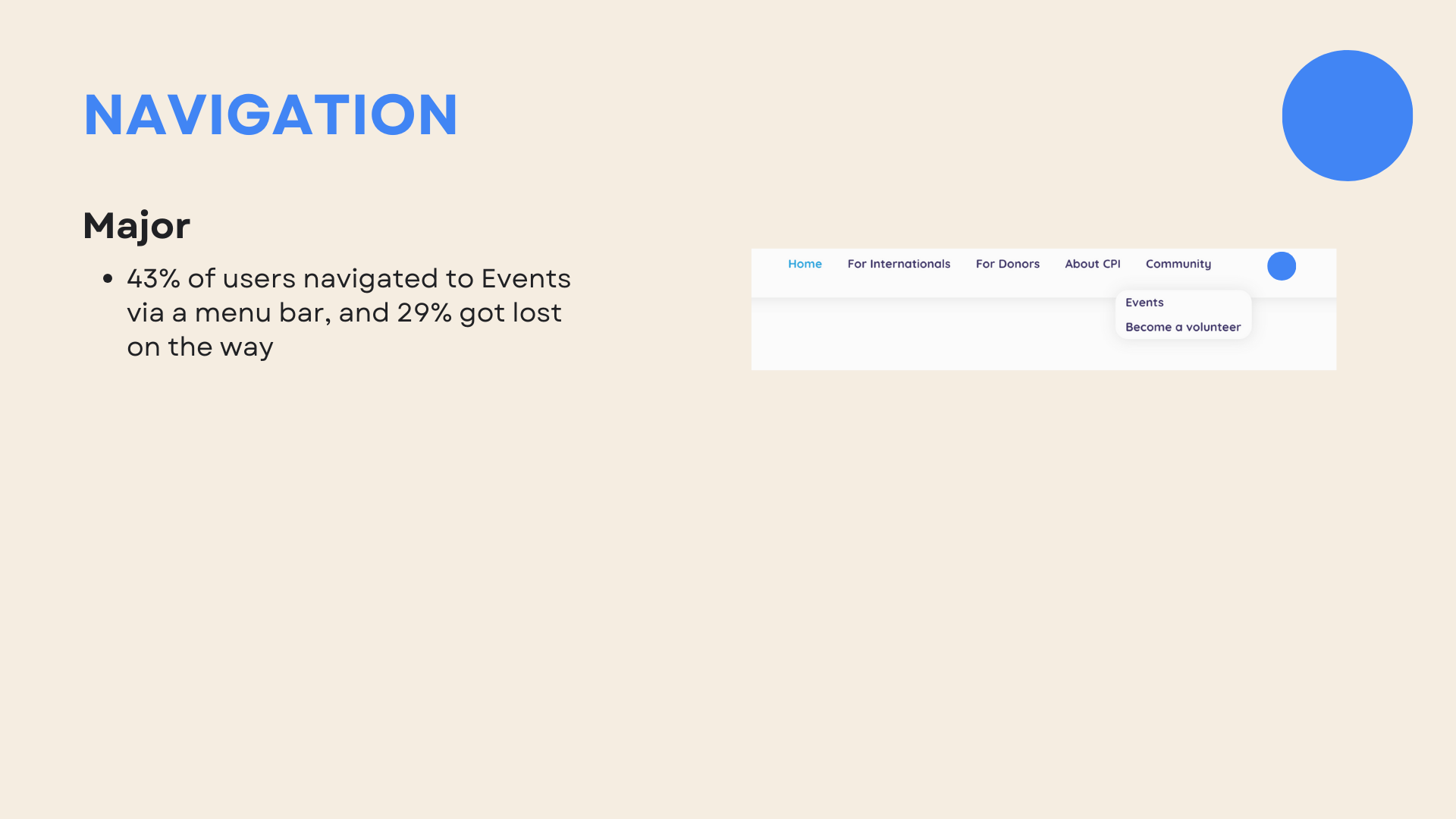
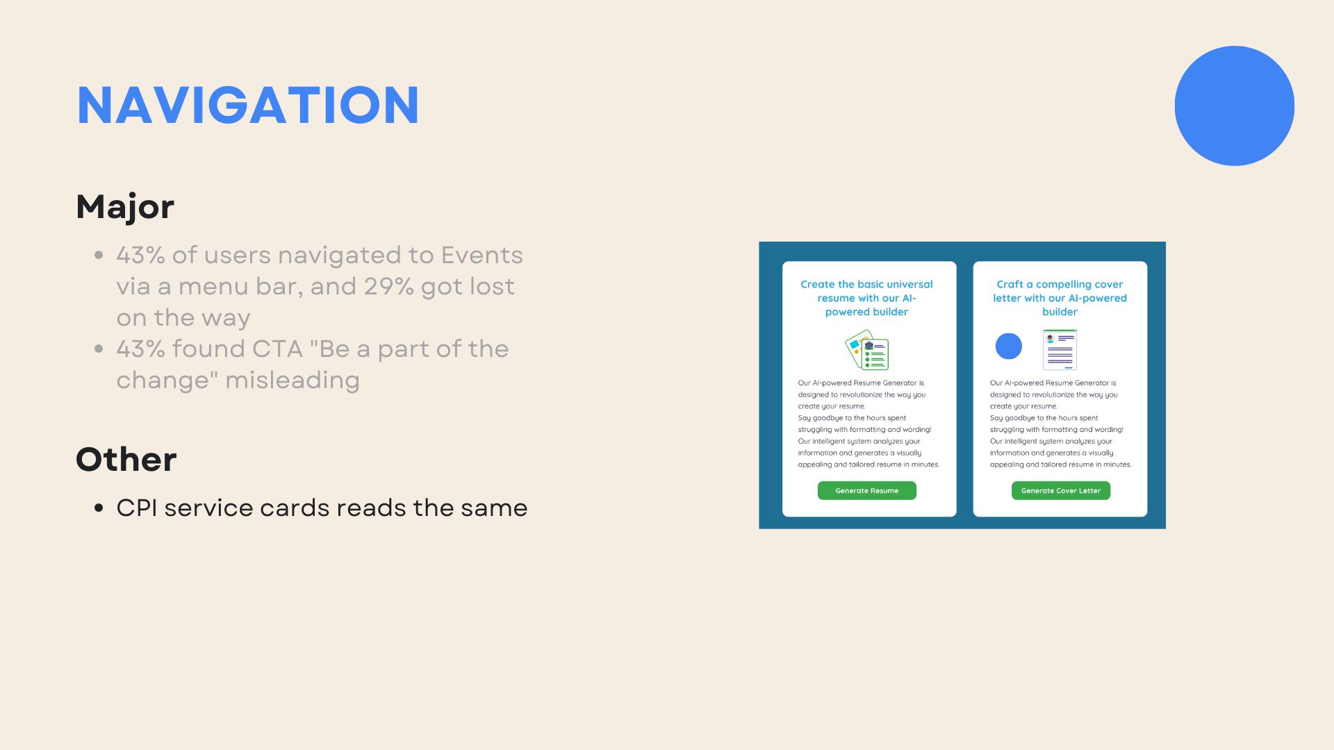
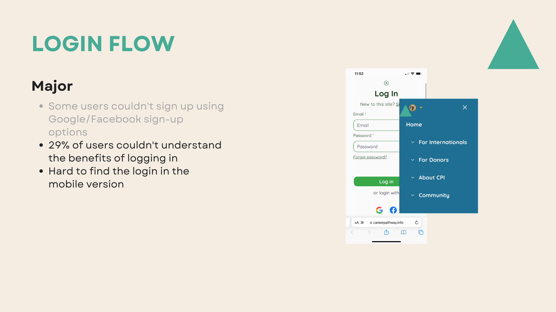
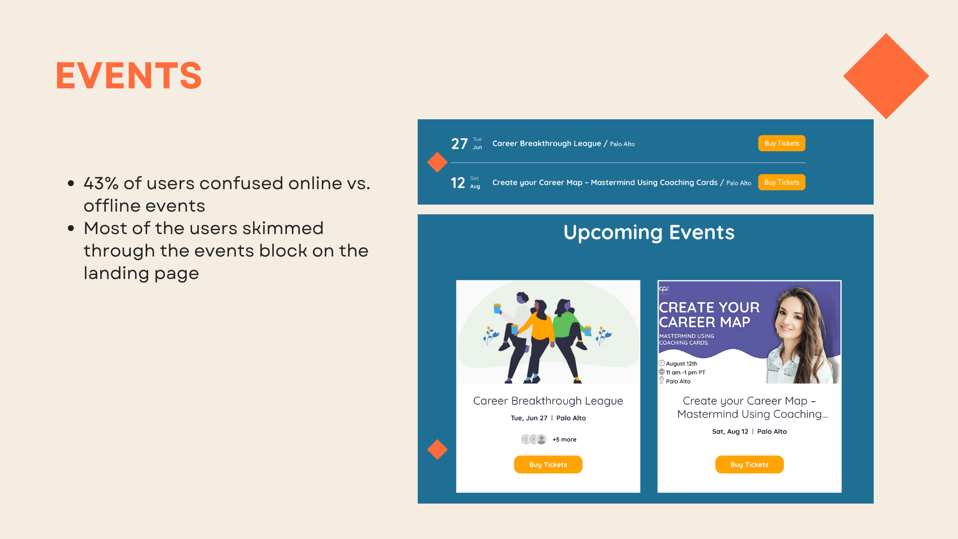
43% of Users navigated to Events via a menu bar, and 29% got lost.
Most users got stuck with CTA naming on the first screen or found it misleading.
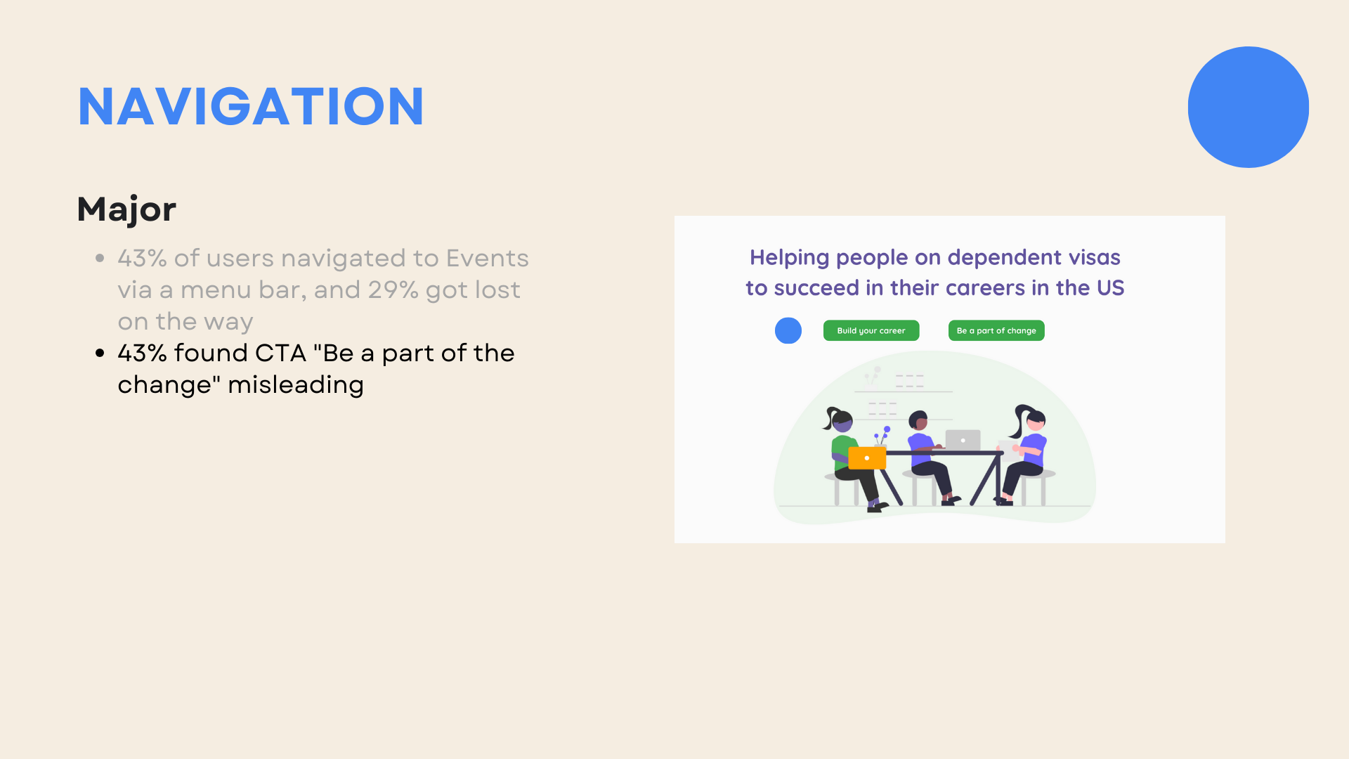
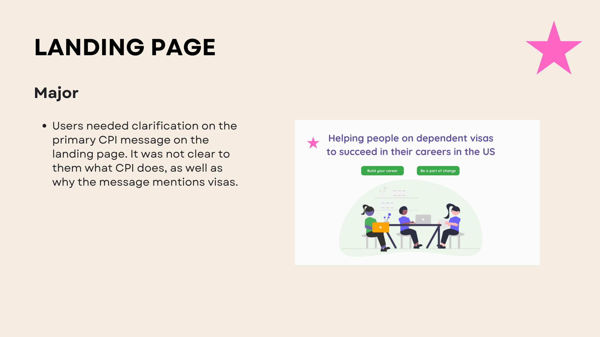
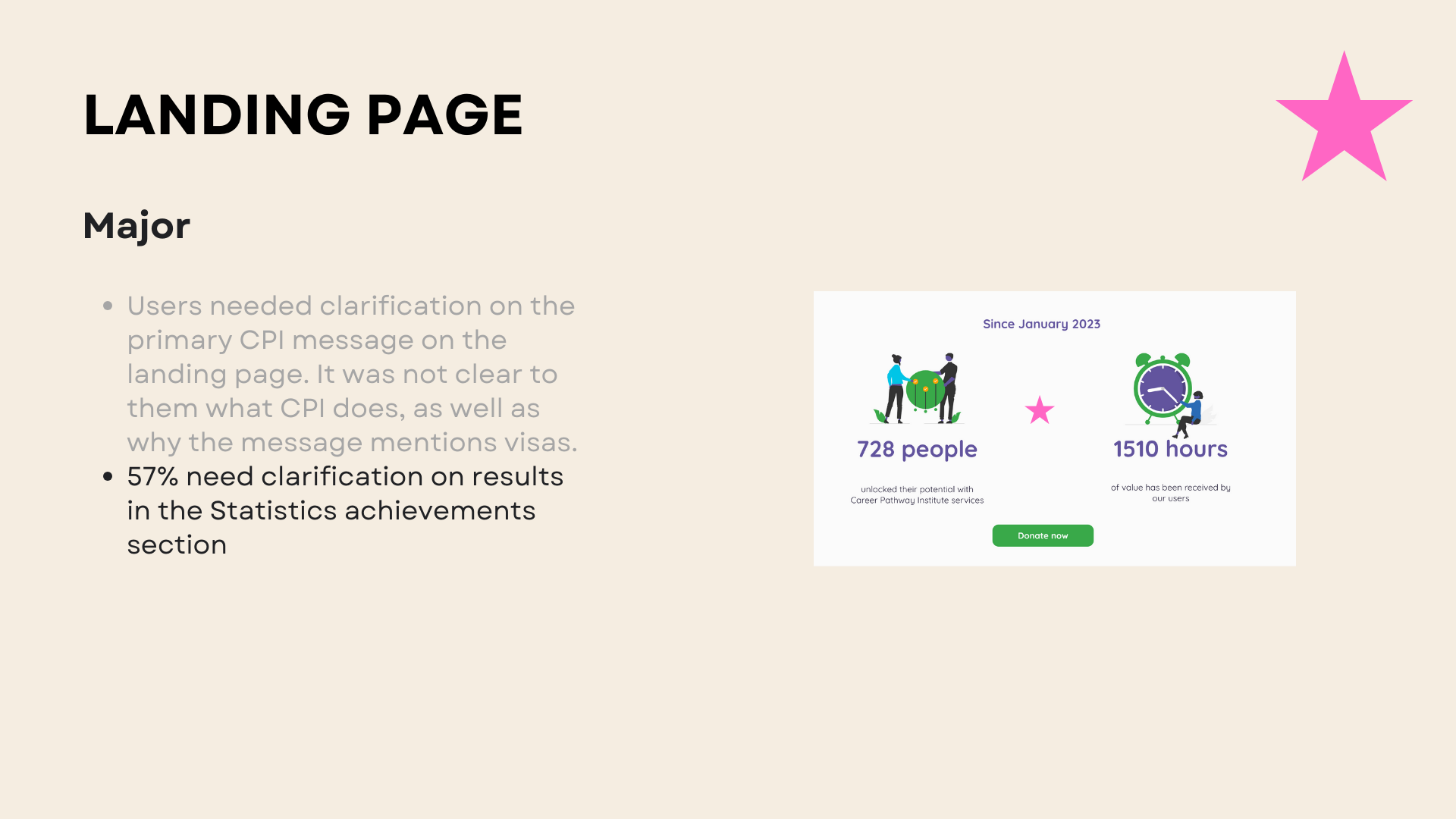
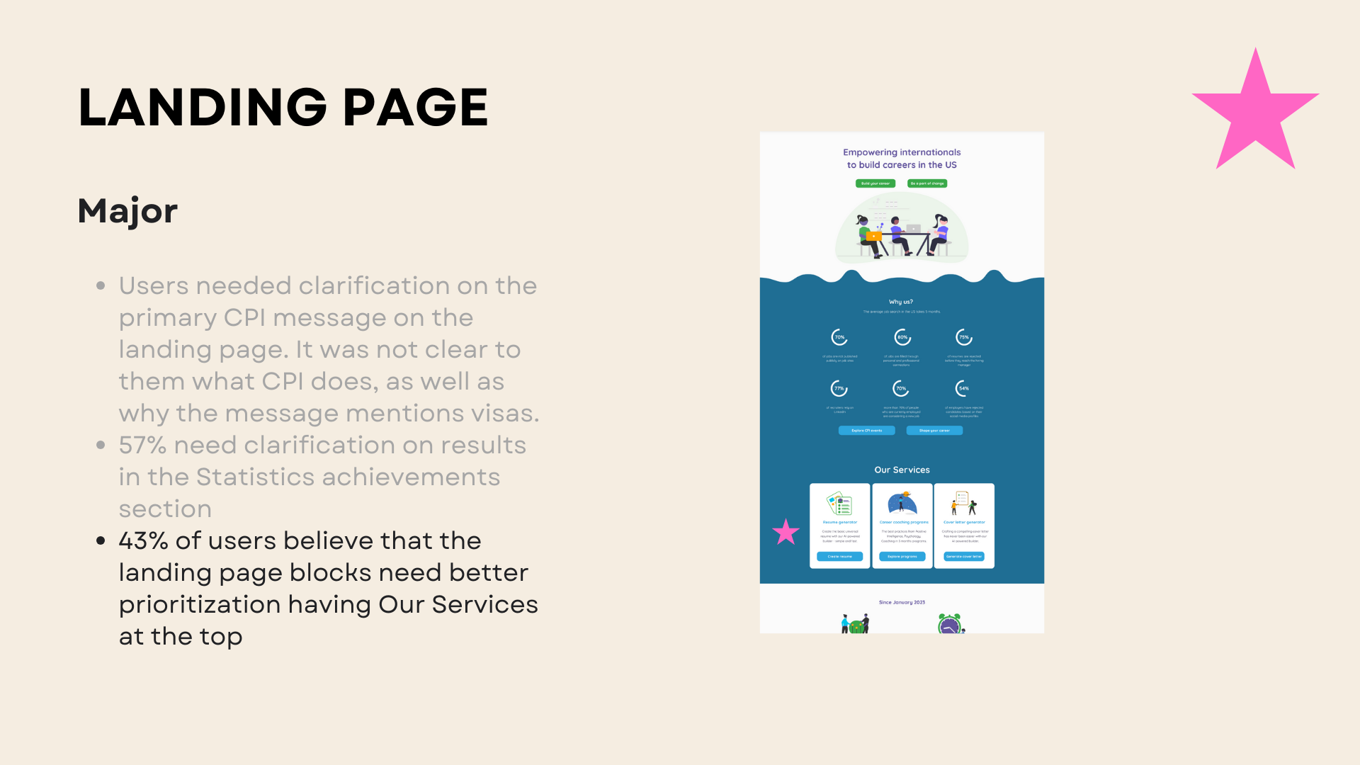
Most users needed clarification on the primary CPI message on the landing page. It was not clear to them what CPI does, as well as why the message mentions visas.
07/09. UX vocabulary Analysis. How can we speak with users better?
Interview analysis

Suggested vocabulary

Goal
Improve user experience by using the same linguistics that the user does.
As a result, improve bounce rate and % of sign up during the next iteration.
Method
We used AI tools (Parrot AI and ChatGPT) to analyze interview recordings in terms of the words most used.
By reducing the content to the list of words that were the most popular, I created a list of UX vocabulary recommendations for the CPI marketing team to use in upcoming content work.
Result
A UX vocabulary file with verbs, adjectives, and recommended phrases to use allover the website to connect with users more.
NEXT STEPS
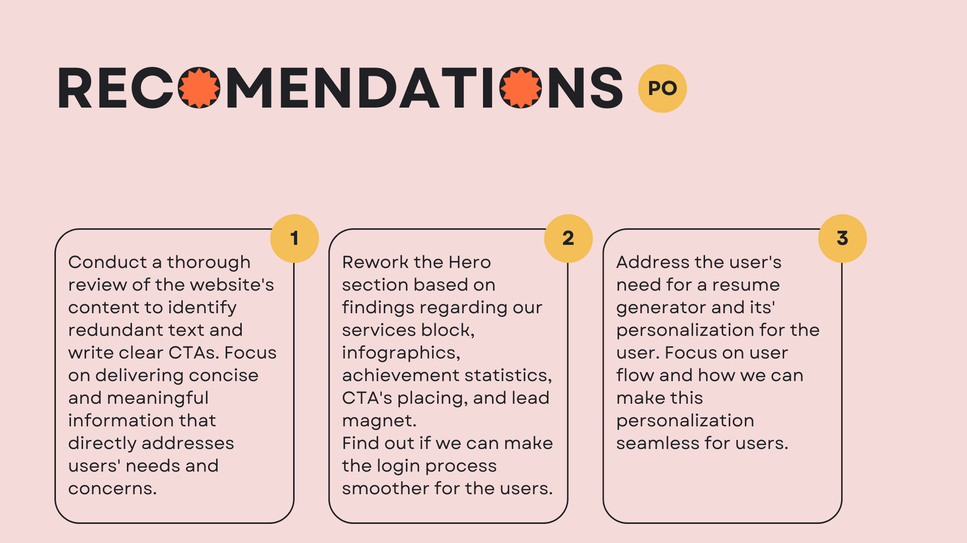
Restructure the storytelling of the landing page to promote services as a P1 and events as a P2 on the page.
Work on the hero section to smooth the user journey through the platform to the signup action.
Lighten up the value of the services provided for users and why users need them.
Stick to the UX Vocabulary list for most content and reduce the amount of text while connecting with a user through the same language.
INTERIM OUTCOMES
Bounce rate 51.9%.
New features implemented: Job posting for volunteers, Resume Generator, and Financial reports.
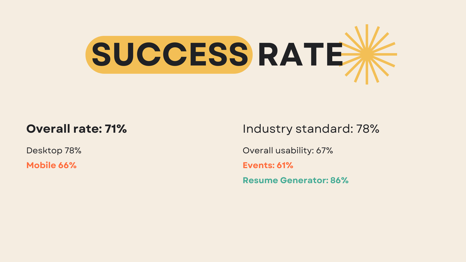
Usability test success rate 71%, including desktop platform 78% and mobile platform 66%.
Task scenario success rate: overall usability 67%, events: 61%; Resume Generator: 86%.
08/09. Reimagining the platform. Ideation.

09/09. Reimagining the platform. Platform redesign in progress.

New features Concept
Career pathway feature
As the next feature to accompany the Resume and Cover letter generator, CPI allows users to create and keep track of their career goals. The new feature is an interactive board where users can investigate the industry-level lists of the skills to learn for their next career step and create an actionable to-do list in the long run to accomplish their goals.
The target audience is highly skilled immigrants who want to clarify their US career tracks. Based on the quantitative CPI research, they usually need help adapting to the job market requirements in terms of skill set in their field in the US. Almost 100% of participants said they need help tracking how they can get to their dream job and where to find actionable career learning resources.