

Mir Ukraine Foundation

Meet MirU – web presence for a non-profit organization to increase their donation flow through partnerships with hospitals and big medical institutions.
Two doctors created a non-profit organization called Mir Ukraine Foundation (MirU) after February 24th, 2022. We met with the founders Darya and Ksenia in April 2022 when they planned to increase the donation flow through partnerships with hospitals and big medical institutions or companies. I was the only designer on the project.
Role
UX/UI Designer
Location
Fairfield, CT
Timeline
Apr – Jul 2022
Tools
Adobe Creative Suite, Figma
Responsibilities
Visual Design, Usability testing, Branding
Team
The solo designer in a team of 2 stakeholders and a software engineer
PROBLEM
Engagement: Private donation amounts didn’t cover the inquiries from Ukrainian volunteers.
Trustworthiness: No official online presence besides Gofundme.
Partnerships: Local hospitals offered money/medical supply support but can’t donate it through Gofundme.
OUTCOME
Engagement: Weekly donations increased by 218%.
Trustworthiness: Scheduled two new fundraising events during launching week.
Partnerships: Launched a website alongside a style guide and marketing materials for future development.
Process
01/09. Market Research. Who are these people, and how do they donate?
Target Audience
35+ y/o people living in Tri-state area.
Healthcare workers and medical management staff.
Resource: Client's Gofundme analyticsWhy people give money
Charitable giving is contagious, spreading through social media.
Most users are more responsive to charitable pleas with a single, identifiable beneficiary.
People are more likely to donate to an organization with a familiar face.
Resource: The Guardian articleCharitable statistics
Half of the nonprofit website traffic came from mobile and tablet users.
Mobile accounted for 40% of all visitors, tablets for 10%, and desktop users made up the other 50%.
55% of people who engage with nonprofits on social media take some action.
Resource: NP Source research02/09. How do other non-profits operate?

INSIGHTS
Engagement
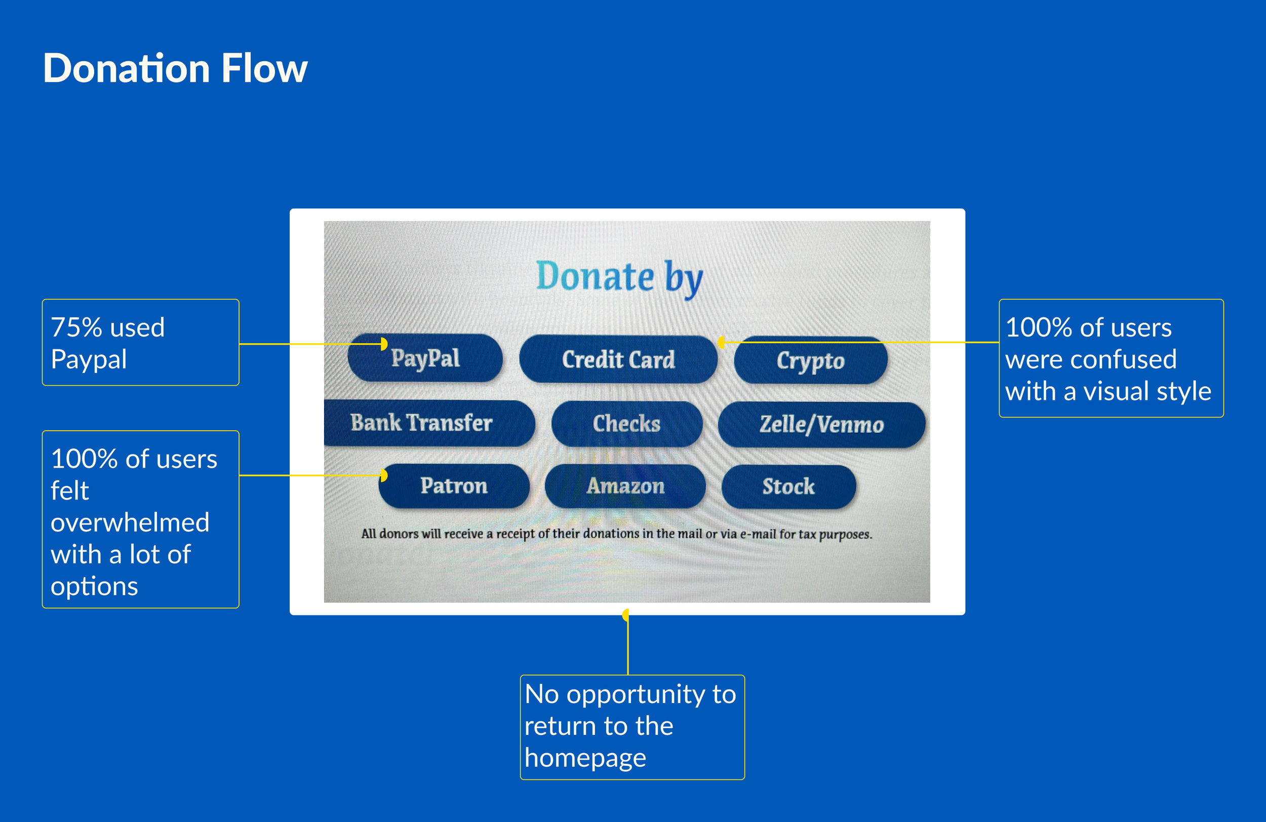
Either too many or too few payment options. Add various methods, then test to choose the most popular.
Create an informational hierarchy to promote the engagement of the users. Highlight the essential information through IA to guide through the foundation’s projects.
Engage with users through volunteer day-to-day activities.
Use infographics to avoid big chunks of text.
Trustworthiness
Implement modern and airy design. Leave Ukraine color to increase recognition.
Add social media icons to the header and an Instagram block to give easy access to explore foundations’ social media.
Promote openness through the photos and financial statements on how the team works daily.
Partnership
Highlight existing partnerships for a local feel and establish new partnerships.
Use active verbs and Ukraine to create an MVP statement.
03/09. What should be on the website to connect with users?

PRIORITIES
Engagement: Implement modern design in Ukrainian colors.
Engagement: Change emotionally intense photos with people helping other people.
Trustworthiness: Infographics as a method to present the foundation’s results.
Trustworthiness: Promote easy access to social media and connection to the local community.
Partnerships: Focus on money donation.
Partnerships: Test payment methods and create donation options priorities in iteration 2.
04/09. How do we tell the MirU story to the user through the landing page?

Color Accessibility
Having yellow as one of the colors for the foundation has its specifics with accessibility. Yellow will be used as a background or a shape/icon highlight to mitigate possible upcoming issues through the foundation's web presence.

05/09. Design of the first iteration.
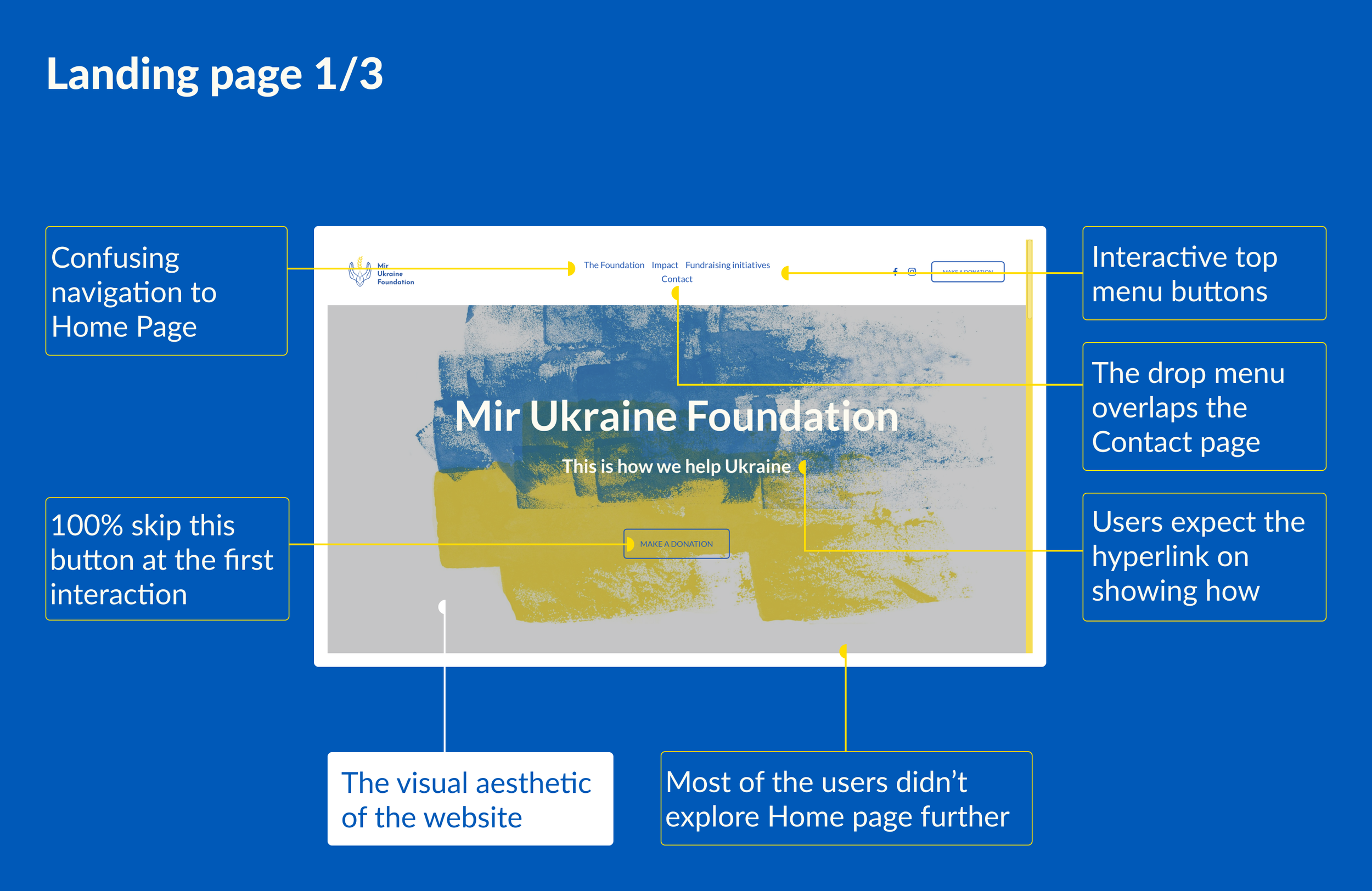
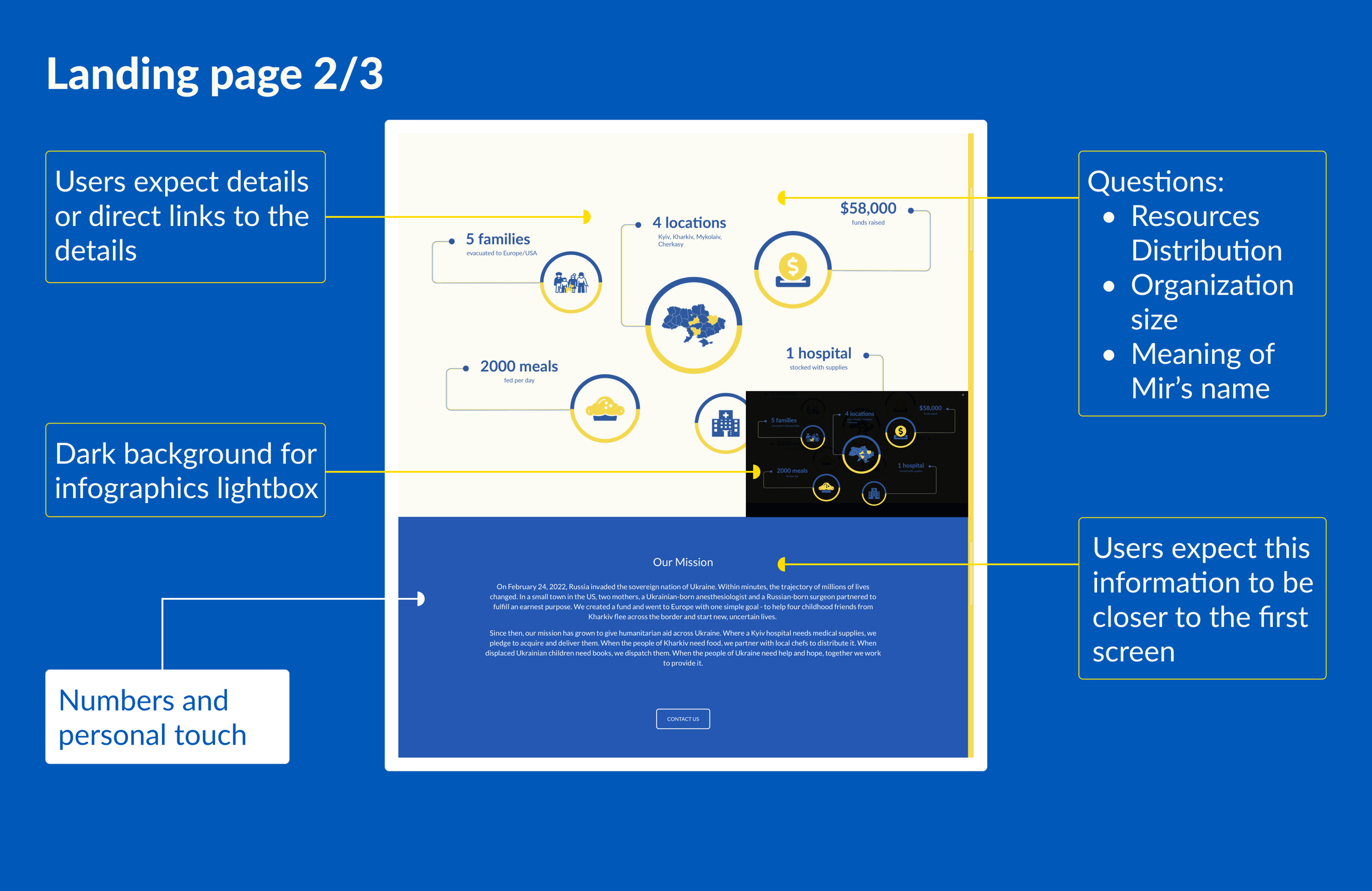
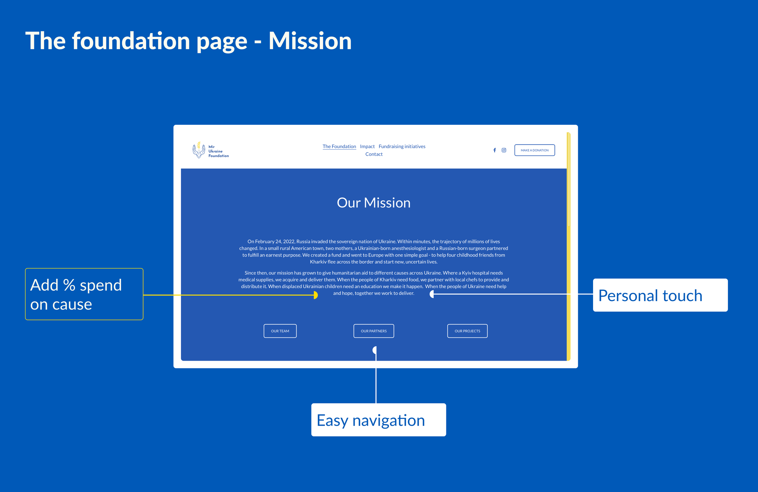
DETAILS LANDING PAGE
To promote local feeling, we put logos of Miru’s partners so that people can connect with the foundations visually through business logos that surround them in real life.
Infographic block helped us lighten up the website’s feeling while promoting trustworthiness.
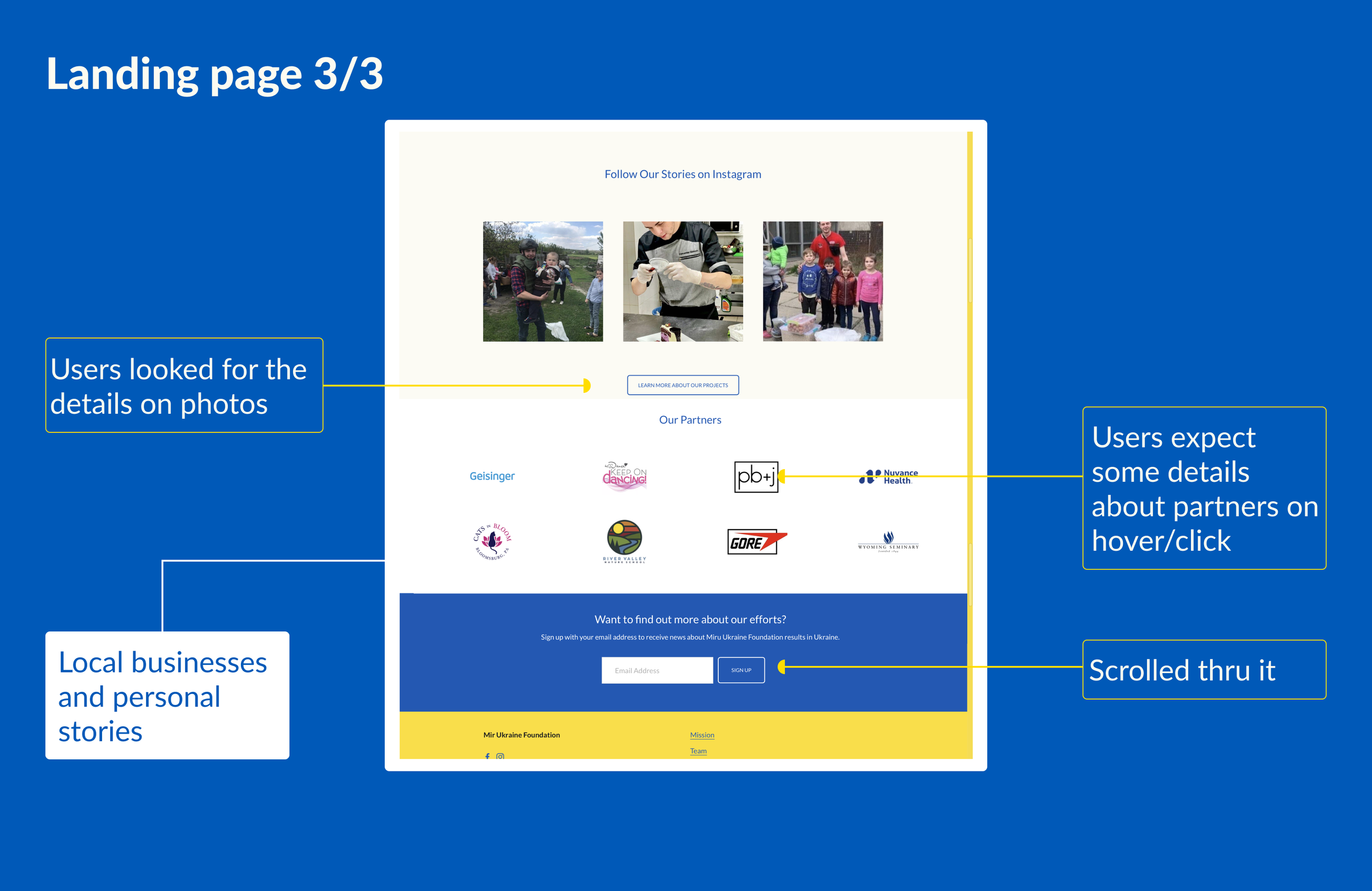
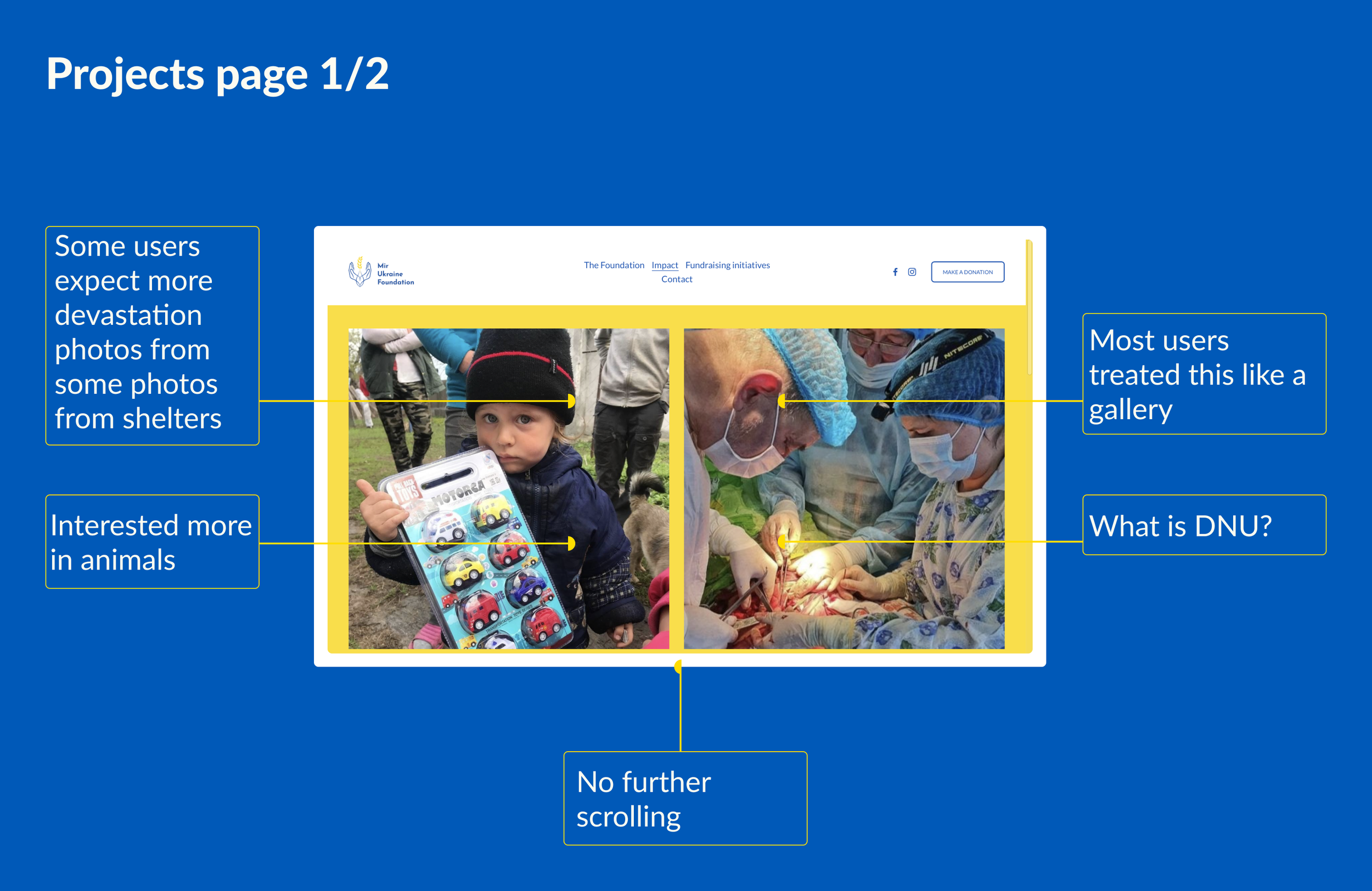
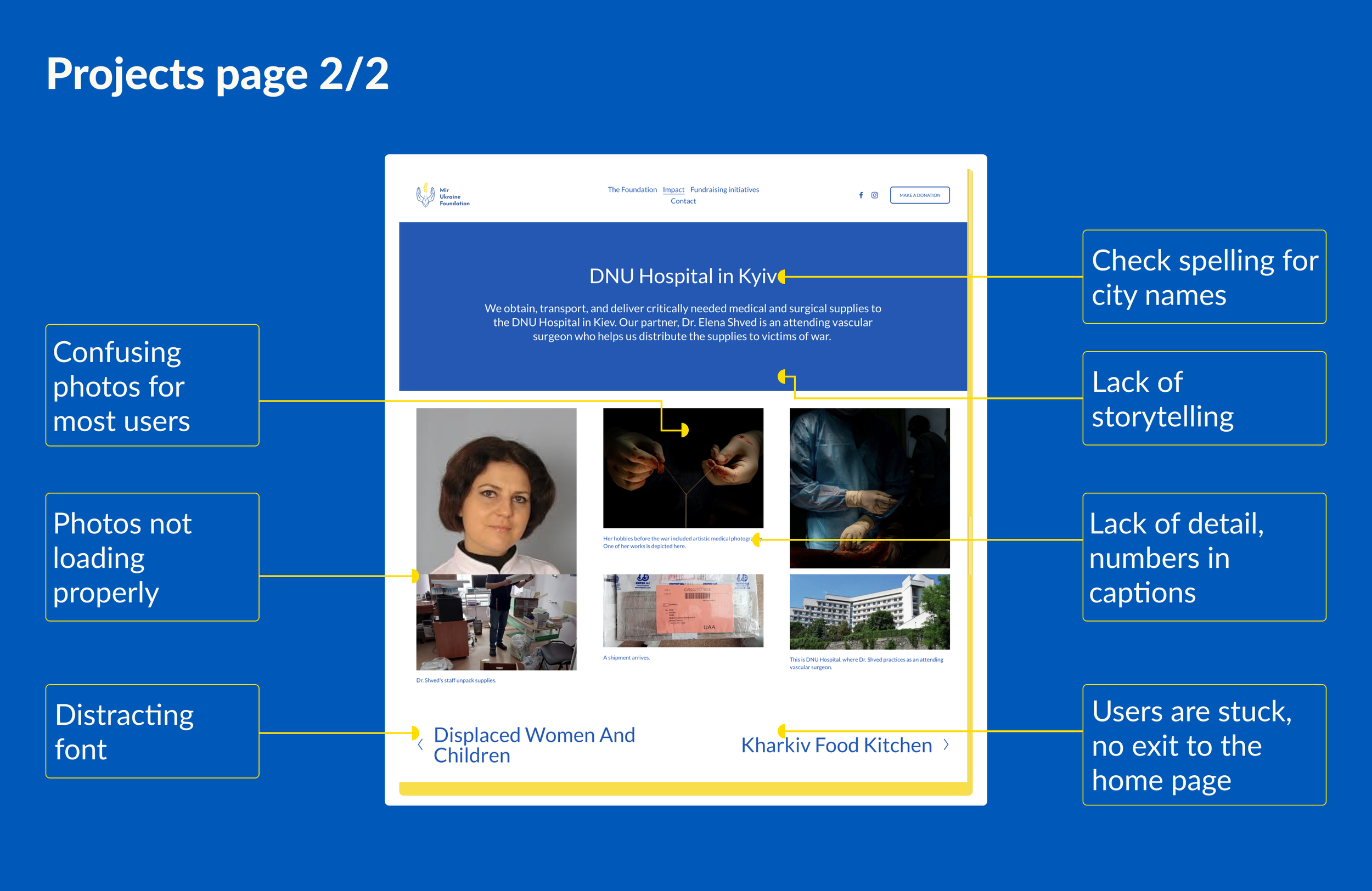
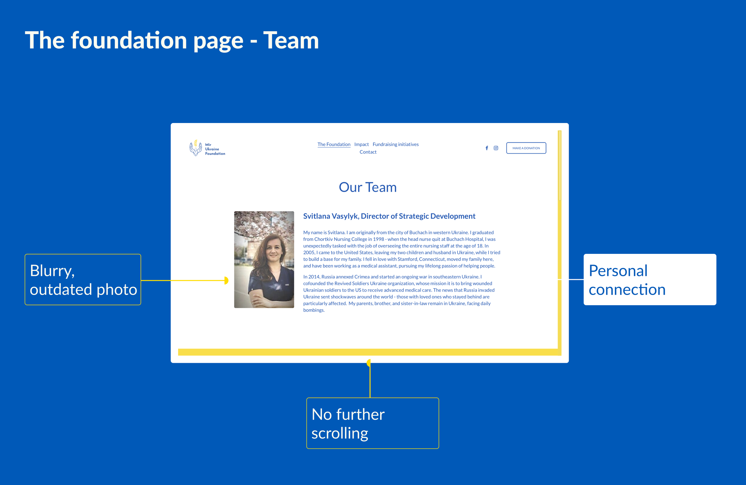
DETAILS FOUNDATION PROJECTS
It’s hard to connect with experiences you don’t have, so using the images of the foundation process alongside beneficiaries of foundation work helped users connect with the cause through the website.
06/09. How are our users willing to donate through the website?
Task
Find out if this foundation is reliable.
Make a donation.
Study type
Online Zoom interviews of 8 participants on the desktop platform.
Participants
35+ y/o healthcare workers living in the Tri-state area.
“Can I scan a QRCode or smth?”...
INSIGHT 1
100% of users used their mobile to make a donation.
“... and can I donate for a particular cause or something besides money, like supplies?”
INSIGHT 2
60% of users asked if they can donate to a particular cause.
“It would be nice to recognize not only companies who donate”
INSIGHT 3
80% of users were interested to be recognized as a donor.
“...love the visual aesthetics and colors.”
INSIGHT 4
100% of users liked the aesthetics of the design.
07/09. Some additional donation flow usability tests.


Task
Make a donation most conveniently.
Study type
Online Zoom interviews of 5 participants on the desktop version.
Participants
35+ y/o healthcare workers living in the Tri-state area.
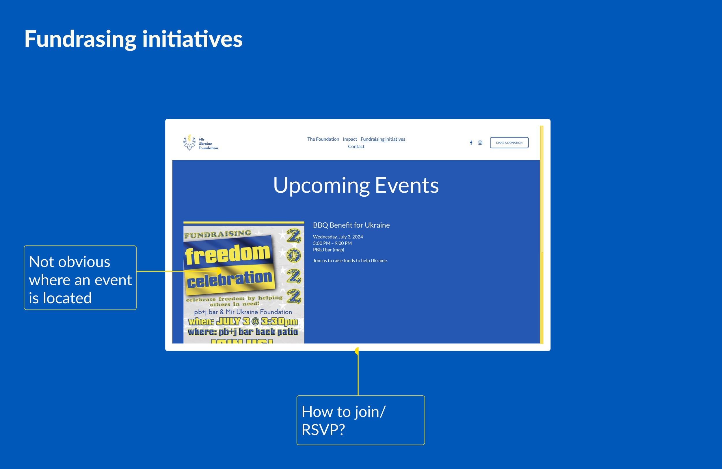
08/09. How can we make donation flow smoothly for the user?


09/09. Website launch
RESULTS
Engagement
Weekly donations increased by 218%.
Trustworthiness
Scheduled 2 new fundraising events during launching week.
Partnerships
Launched a website alongside a style guide and marketing materials for future development.
You can check out and help Mir Ukraine Foundation by clicking here.
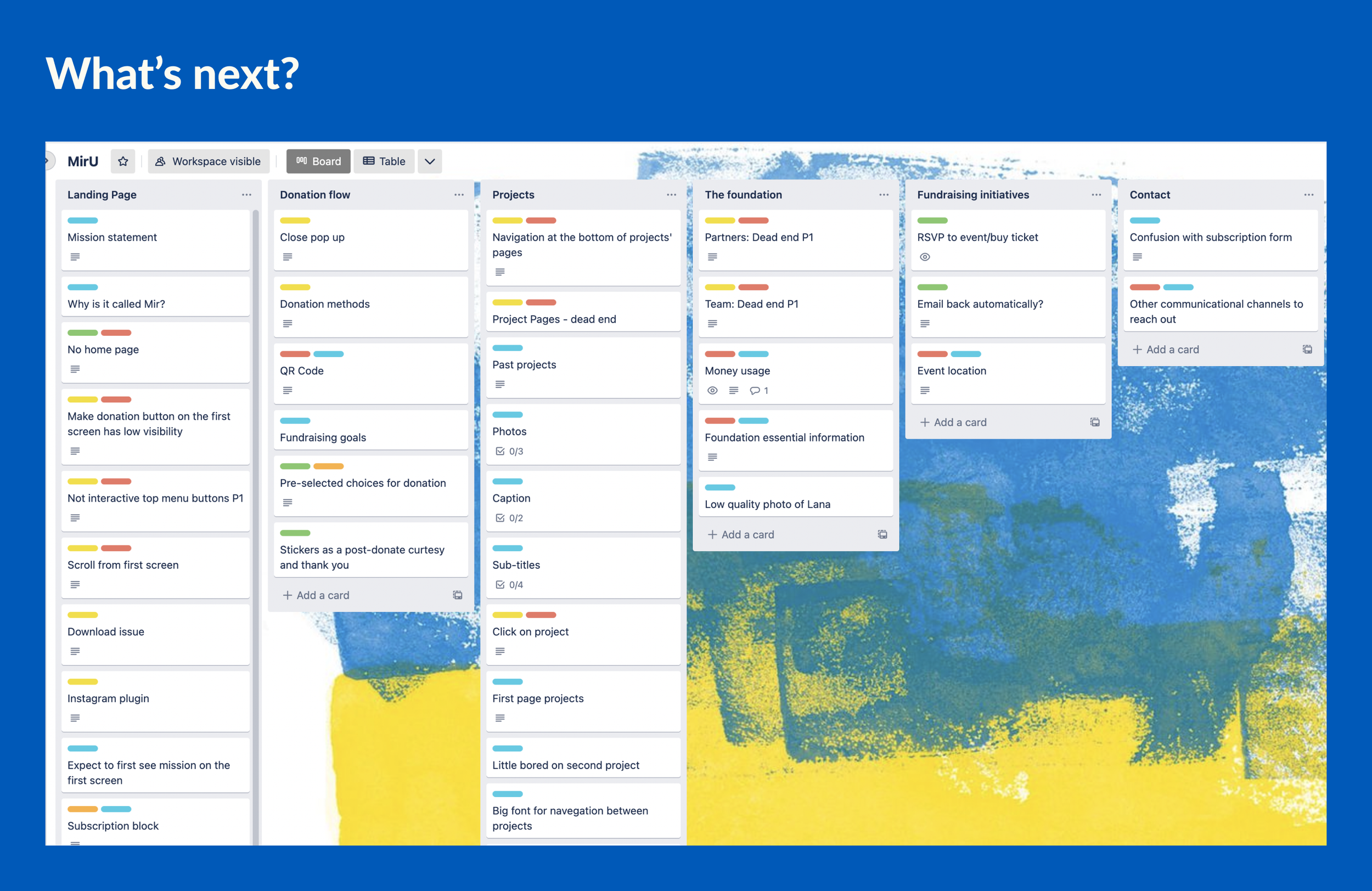
Next steps
Check analytics for bounce/exit rate, drop-out pages, etc.
Add a monthly donations feature and an opportunity to choose what cause to support.
Add donation flow with the opportunity to donate goods to big medical institutions.