

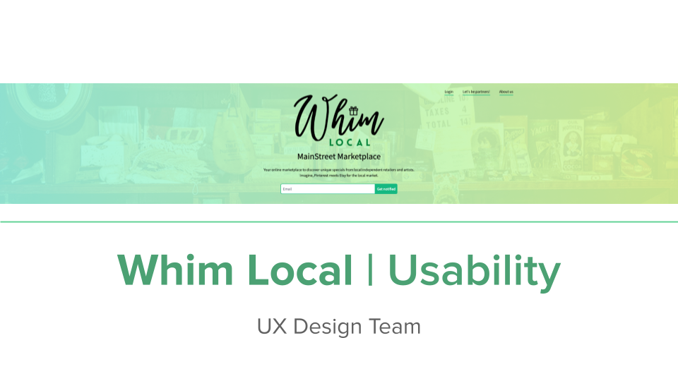
WHIM Local

Meet WHIM Local – a service that connects local retailers and artists with local shoppers in the San Francisco Bay Area, CA. It’s a startup that launched its MVP in September. I joined the team a few weeks before that with my two colleagues.
The company helps local businesses by providing a highly trafficked, SEO-optimized online space where they can collectively promote their products. And by providing businesses with automated tools to streamline their social media marketing activities. You can check if WHIM Local is available in your town by clicking here.
Role
Product Designer
Location
Foster City, CA
Timeline
Aug 2021 – Feb 2022
Tools
Adobe Creative Suite, Figma, Miro
Responsibilities
Visual Design, UX Design, Branding
Team
4 Product Designers, 2 Engineers
OUTCOME
94% positive feedback from both user roles (shopper and vendor) after the new design implementation.
Two local Christmas holiday markets in the San Francisco Bay Area launched on WHIM Local in 2021.
Created and implemented visual style guides and UI components library for future features.
Partnership with Foster City Chamber of Commerce to use platform for local events.
PROBLEM
During COVID-19, 65% of businesses closed in the San Francisco Bay Area, CA, and almost half didn’t have an internet presence.
The most hit got businesses operating for 4‐6 years, with monthly revenues of $50,000‐$100,000 (annual revenue of about $0.5‐1 million), leasing their business locations, with owners aged 51 years and over and mixed‐race owners. Arts, entertainment, and recreation reported a significant drop in revenue/sales/receipts.
Resource: SFOSBProcess
01/05. Secondary research. Who are our users?


Archetypes of two leading user roles in the flow based on the market research and raw data the CEO already had. I was responsible for creating a Vendor user type.
02/05. Product Audit. What went wrong with the user experience?

Due to a tight schedule and limited resources, we started with a Heuristic evaluation of the desktop and mobile platforms to eliminate critical issues before launching. We used the Feedback capture grid for the quickest result based on 10 Usability Heuristics by Nielsen-Molich.
I was responsible for the Feed feature slides, which included:
heuristic evaluation analysis
findings prioritization
action plan creation
slide deck design and presentation for the feature action items.
INSIGHTS: General
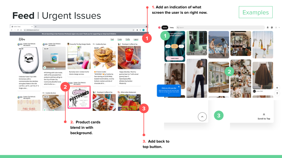
100% of screens didn’t indicate where the user is right now.
Scrolling through the screens takes a long time to get the information the user needs, with no shortcuts or CTA duplication.
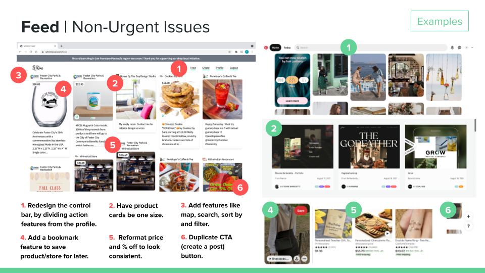
The control bar mixed CTA and exploratory pages.
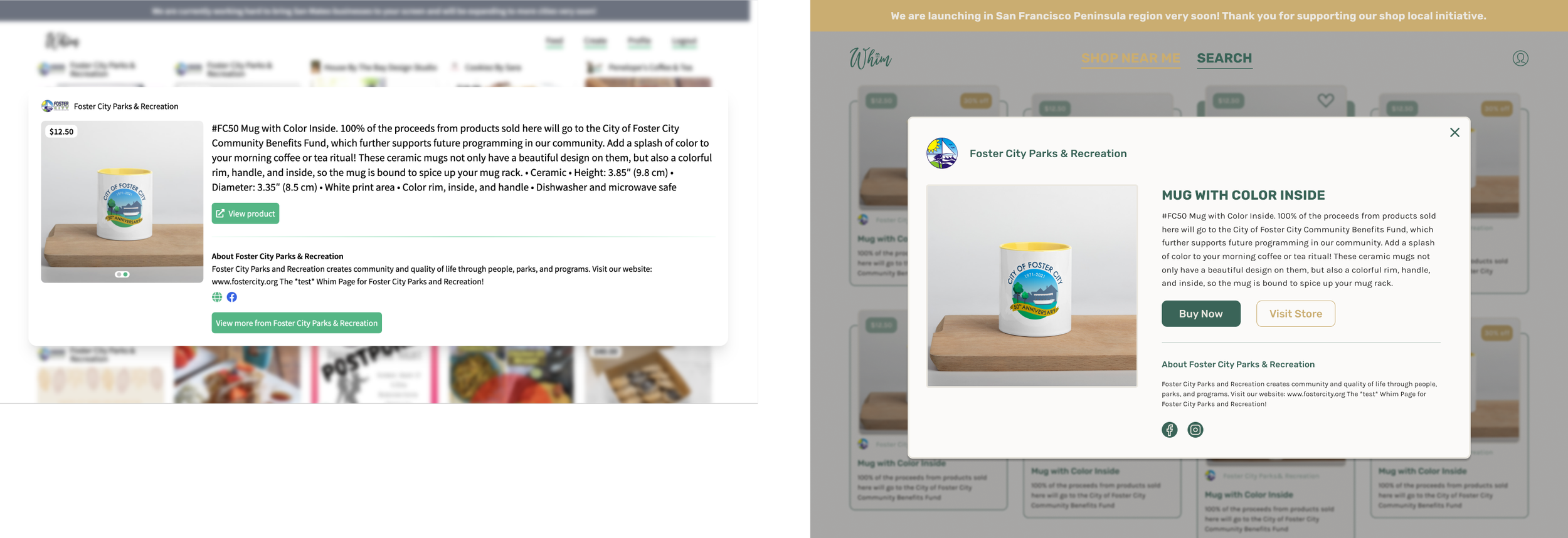
INSIGHTS: Main Feed
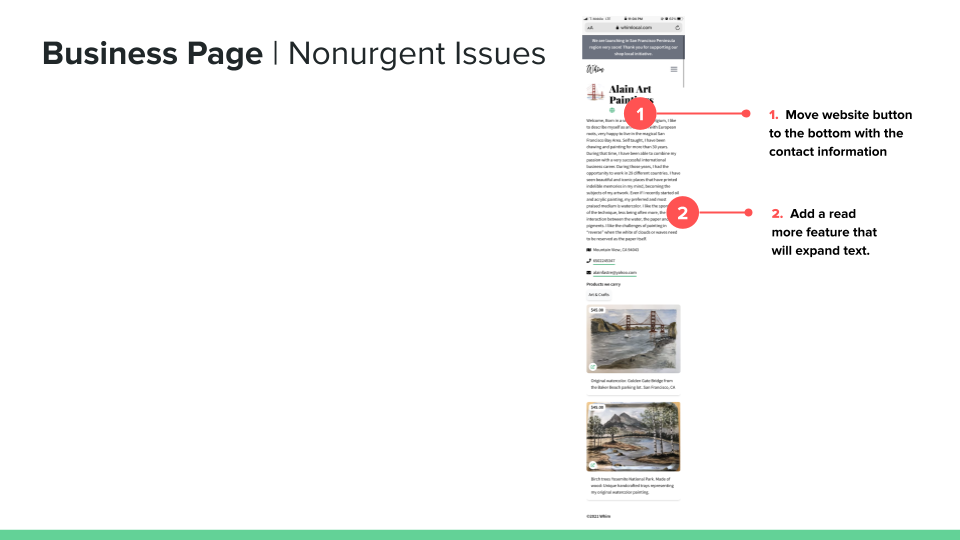
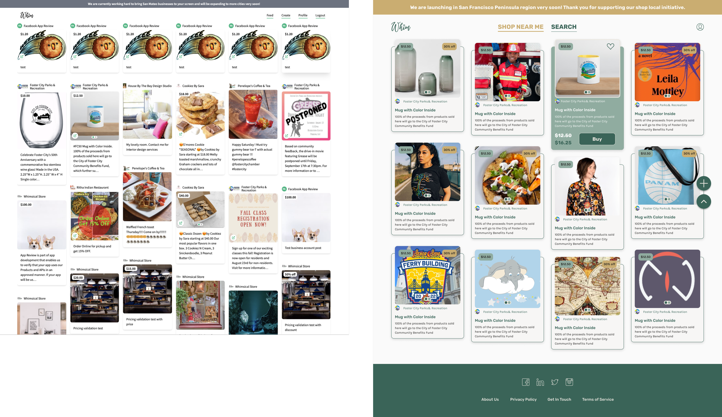
The main feed screen blended product cards because of a lack of visual hierarchy.
Inconsistency in sizes and content of the product cards.
Some industry-standard features, like filters, bookmarks, search, etc., are missing.
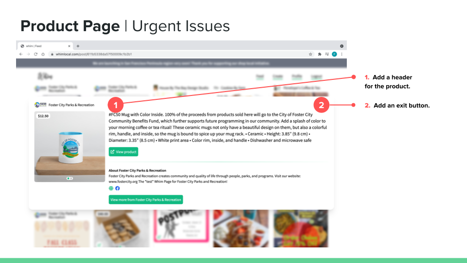
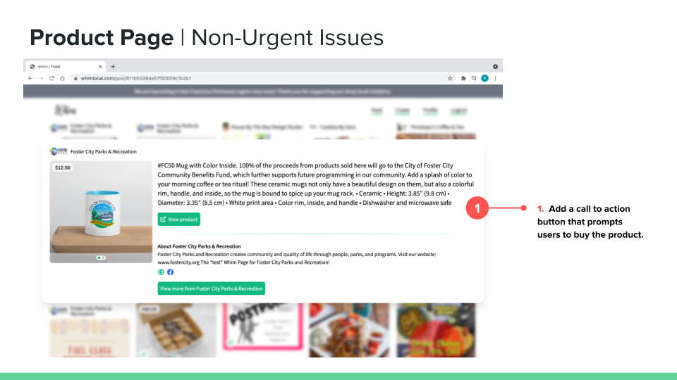
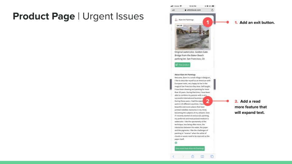
Lack of user control on the product details card like no exit button, CTA button, etc.
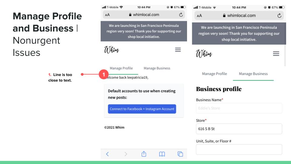
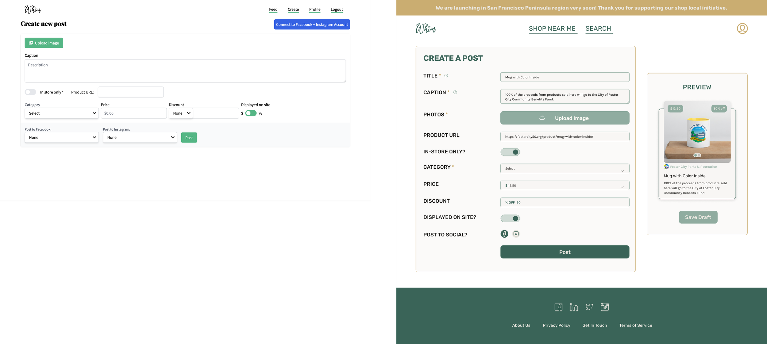
INSIGHTS: Forms
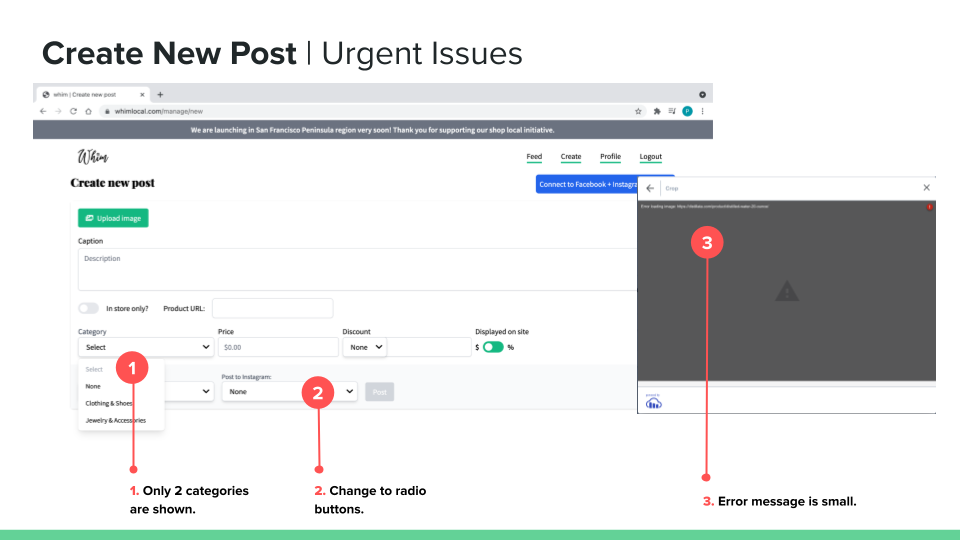
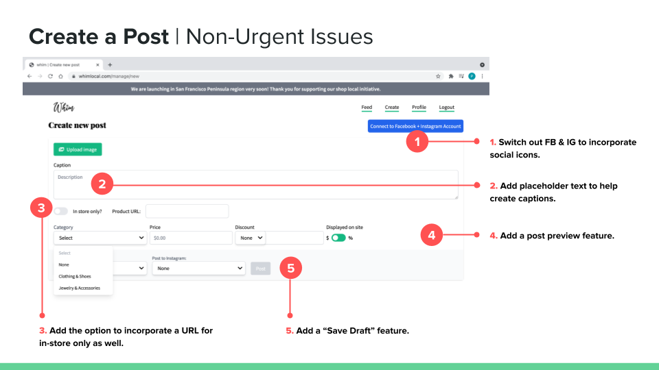
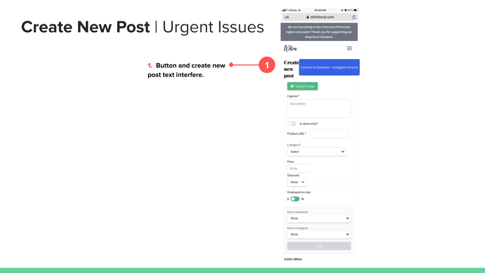
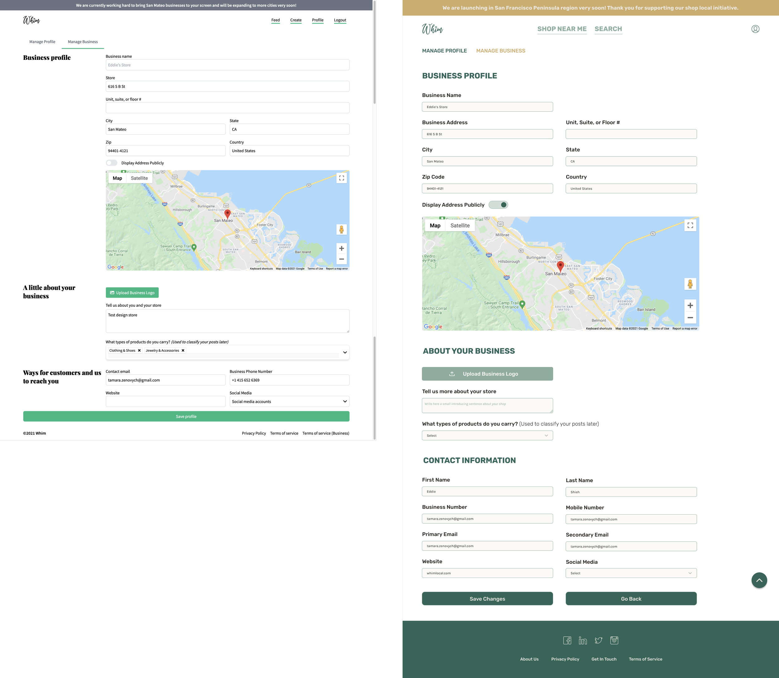
The complicated visual language of the input field is drop-down, mainly for all types of data.
There is no safety preview/draft feature for Vendors before posting their product for sale.
Lack of error-proof features in the input field alongside no placeholders.
Stack back-to-back input fields that added additional user pressure during registration processes.
03/05. Reimagine user flow. How can we guide users through the product better?


Proto-personas for two leading user roles in the flow based on the market research and raw data the CEO already had. I was responsible for creating a Vendor persona.
04/05. Reimagine the platform. What options do we have?

I was responsible for reimagining the Feed page. The main focus was to lift the content overload from the user and provide him control over the product through better navigation and Search and Sort features. I used Crazy 8’s sketched ideas. You can see part of the on the left.

Whim Local didn’t have style brand guidelines or something similar when I joined the team. One of the priorities was bringing some good-looking, vibrant visuals to brand style to the product.
I did a quick competitor analysis, and we presented two options for the product.
1. The brand already had green as a primary color, so the first one had a more natural, calm, supporting feeling.
2. On the other hand, Whim Local was created as a local Pinterest, helping people to explore businesses around them. So, the second option was more about curiosity, energy, and readiness for new experiences.
After talking through both options with the team, we moved further with the first option, which suited brand presentation and marketing goals better.
05/05. Platform redesign.


OUTCOME
94% positive feedback from both user roles (shopper and vendor) after the new design implementation.
Two local Christmas holiday markets in the San Francisco Bay Area launched on WHIM Local in 2021.
Created and implemented visual style guides and UI components library for future features.